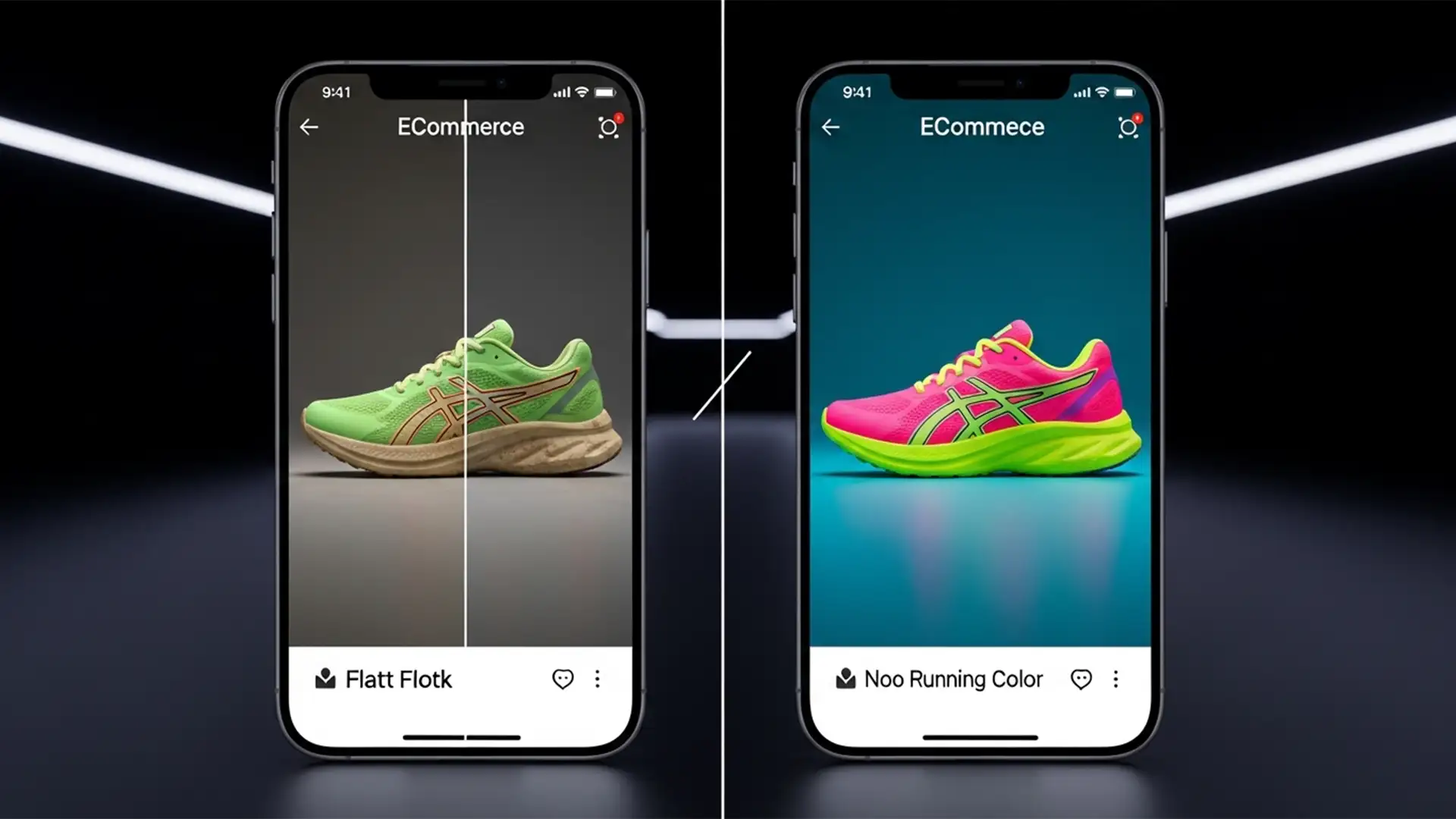
You just spent hours perfectly retouching a highly vibrant, neon product for your ecommerce store. It looks stunning on your calibrated professional monitor. But the moment you upload it and check it on an iPhone, the colors collapse. The vibrant neon green has turned into a muddy forest green; the glowing hot pink now looks like a flat, dusty rose.
If your product colors look dull on mobile devices, you are experiencing the dreaded “neon color shift.”
This happens because modern mobile devices use a completely different color space than legacy web standards. If your current Photoshop export workflow doesn’t account for this hardware evolution, you are actively degrading your product presentation and risking higher return rates from customers who receive products that “don’t match the picture.”
Here is the technical breakdown of why this happens, and exactly how to fix it in Photoshop (v25.x – v27.x).
Why the “Neon Color Shift” Happens on Mobile Displays
To understand the fix, you need to understand the hardware. Modern mobile devices—including all recent iPhones and high-end Androids—utilize a Wide Gamut Display known as Display P3.
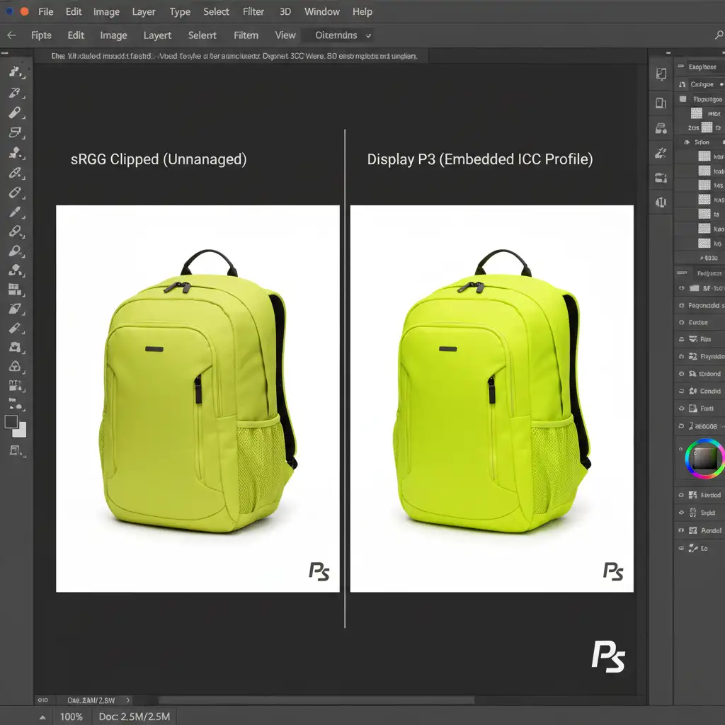
The Display P3 Color Gamut can capture and display roughly 25 percent more color than the traditional sRGB standard that the internet was built upon.
The problem occurs during the export phase. When ecommerce editors use Photoshop’s legacy “Save for Web” settings to export neon or highly vibrant images, the software often strips out the metadata or forces a harsh compression. Without proper Color Profile Embedding, the mobile browser doesn’t know how to render the file. It defaults to an unmanaged sRGB rendering space, aggressively clipping the out-of-gamut neon pixels and leaving your product looking flat and lifeless.
3 Ways to Fix Product Colors Looking Dull on Mobile
To guarantee that your product images look exactly as intended on a modern smartphone, you need to implement a strict color management workflow. Here are three methods to resolve the neon color shift, ranging from a quick export fix to a professional retouching workflow.
Method 1: The Quick Fix – Modern Export Settings
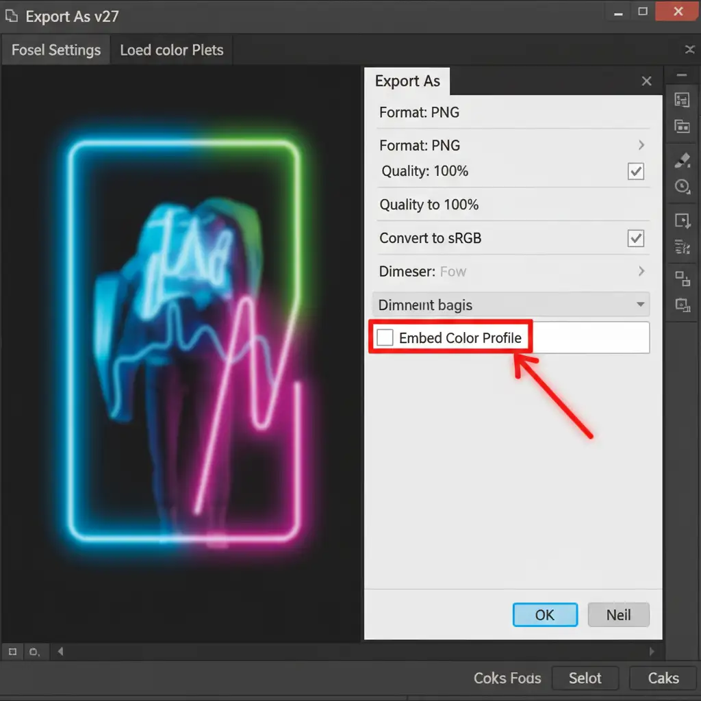
If you just need to get the file out quickly without losing your vibrant colors, abandon the legacy “Save for Web” dialog. Instead, use the modern “Export As” function.
- Navigate to File > Export > Export As.
- Look at the “Color Space” settings on the right-hand panel.
- Crucial Step: You must check Embed Color Profile. This attaches the ICC Profile to the image data so the mobile browser knows exactly how to render the colors.
- From here, you have two choices depending on your platform:
- For baseline compatibility: Check Convert to sRGB alongside Embed Color Profile. This ensures safe rendering across all devices, even older ones.
- For maximum mobile vibrancy: Uncheck Convert to sRGB but keep Embed Color Profile checked. This preserves the full Display P3 gamut specifically for modern mobile platforms.
Method 2: The Pro Workaround – Display P3 Soft Proofing
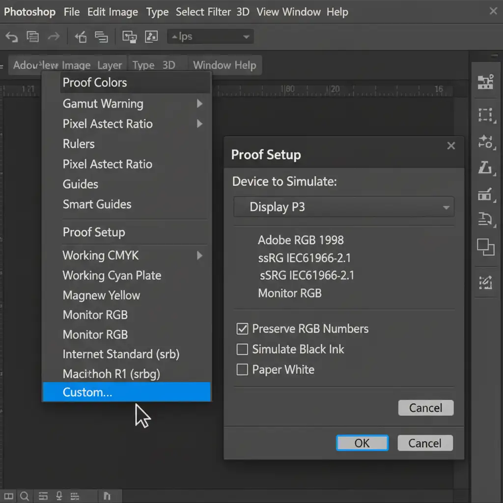
If you want total control over how the neon color shift is handled, you shouldn’t rely on automated export clipping. Instead, use Soft Proofing to see exactly how the image will degrade, and fix it manually before exporting.
- Go to View > Proof Setup > Custom.
- In the “Device to Simulate” dropdown, select Display P3.
- Turn on your Gamut Warning by pressing Shift+Ctrl+Y (or Shift+Cmd+Y on Mac). This will highlight all the pixels that are going to clip on a standard display.
- Add a Hue/Saturation or Vibrance adjustment layer.
- Gently reduce the saturation or shift the lightness of the targeted color channel until the gamut warning overlay disappears.
By doing this, you are ensuring a controlled, aesthetically pleasing shift rather than an automated, muddy look.
Method 3: The Technical Deep-Dive – Convert to Profile
For high-volume ecommerce studios, the most mathematically accurate way to handle extreme neon colors is by converting the profile before you even open the export dialog.
- Go to Edit > Convert to Profile.
- Set your Destination Space to either sRGB (for universal web) or Display P3 (for mobile-first web).
- Under Conversion Options, critically set the Intent to Relative Colorimetric.
- Ensure Use Black Point Compensation is checked.
Why does this work? Relative Colorimetric rendering mathematically maps out-of-gamut neon pixels to their absolute closest displayable equivalent without shifting the overall hue of the entire image. Combined with Black Point Compensation, it preserves the contrast ratios in the shadows, ensuring your product retains its three-dimensional shape even when colors are compressed.

Stop Losing Sales to Inaccurate Colors
In the mobile-first ecommerce landscape, color accuracy isn’t just a design preference—it directly impacts your bottom line. If a customer buys a vibrant neon jacket and receives a dull, muted garment, they will return it. Managing ICC profiles, soft proofing for Display P3, and understanding colorimetric intents are mandatory steps for modern online retail.
Don’t want to manage complex color profiles yourself? Let the experts handle it.
At Image Work India and Cloud Retouch, we specialize in high-volume, pixel-perfect ecommerce image editing. Our expert retouchers utilize advanced color management workflows to ensure your products look just as vibrant, accurate, and enticing on a mobile screen as they do in real life.
Stop worrying about gamut warnings and color shifts. Contact Image Work India today to scale your ecommerce retouching and deliver flawless, color-accurate product images to every single customer.