When it comes to selling products online or showcasing them in a catalog, the quality of your images can make or break a sale. A dull, poorly lit photo can turn customers away, while a vibrant, polished one grabs attention and builds trust. That’s where product photography color correction comes in—a simple yet powerful way to enhance your images and make them stand out. Whether you’re photographing jewelry, clothing, electronics, or food, mastering product photography color correction can transform your shots from average to eye-catching. In this article, we’ll walk you through everything you need to know about product photography color correction, offering easy-to-follow techniques that deliver stunning results, even if you’re new to editing.
What Is Product Photography Color Correction?
At its core, product photography color correction is the process of adjusting the colors in your product images to make them look accurate, appealing, and professional. When you snap a photo, factors like lighting, camera settings, or even the background can throw off the colors. That red dress might look orange under fluorescent lights, or a white mug might appear gray in dim conditions. Product photography color correction fixes these issues, ensuring the colors match the real-life product while also enhancing their visual impact.
Unlike color grading, which focuses on creating a specific mood or artistic style, product photography color correction is about clarity and realism. The goal is to represent the product as customers would see it in person—or even better. Think of it as polishing a gem: the raw photo is the starting point, and product photography color correction brings out its true brilliance. For businesses, this is crucial because accurate colors build confidence in buyers, while vibrant, well-balanced tones make the product irresistible.

Why Product Photography Color Correction Matters
You might wonder why product photography color correction deserves so much attention. After all, can’t a decent photo do the job? In a perfect world, maybe—but in reality, lighting and camera limitations often mean your raw images need a little help. Customers rely heavily on visuals when shopping, especially online where they can’t touch or try the product. If the colors in your photo don’t match the item they receive, it can lead to disappointment, returns, or negative reviews. Product photography color correction bridges that gap, ensuring what they see is what they get.
Beyond accuracy, product photography color correction also boosts appeal. A corrected image with rich, true-to-life colors pops off the screen, drawing the eye in a way a flat or washed-out photo never could. This is especially important in competitive markets like e-commerce, where your product is one click away from a dozen others. A crisp, colorful image can be the difference between a sale and a scroll-by. Plus, consistent color correction across your product line creates a cohesive, professional look that strengthens your brand.

Tools You’ll Need for Product Photography Color Correction
Getting started with product photography color correction doesn’t require a huge investment. The right tools and a bit of know-how are all you need. Most photographers turn to software like Adobe Photoshop or Lightroom, which offer precise controls for color adjustments. Photoshop is ideal for detailed, pixel-level edits—like fixing a single off-color spot—while Lightroom excels at batch processing multiple images with consistent settings. If you’re on a budget, free options like GIMP or mobile apps like Snapseed can also handle basic product photography color correction.
You’ll also want a decent monitor with good color accuracy, so what you see while editing matches the final output. If possible, calibrate your screen using a tool like a Spyder or ColorMunki to ensure precision. A gray card or color checker is another handy accessory for shooting—it gives you a reference point for true colors during product photography color correction. With these basics in hand, you’re ready to start tweaking your images.
Understanding the Basics of Product Photography Color Correction
Before diving into specific techniques, let’s cover the foundational elements of product photography color correction. Most editing software provides sliders for temperature, tint, exposure, contrast, and saturation—your go-to tools for color work. Temperature adjusts the warmth or coolness of the image (yellows versus blues), while tint balances green and magenta. These settings help you neutralize any unwanted color casts caused by artificial lights or reflections.
Exposure and contrast come next, affecting how bright or dark your image appears. Getting these right ensures the colors have room to shine—too dark, and they’ll look muddy; too bright, and they’ll wash out. Saturation controls the intensity of the colors, letting you make them vivid without going overboard. The trick with product photography color correction is to find a sweet spot where the colors are true to the product but still eye-catching. Start with small tweaks, and always compare your edit to the real item if you can.

Setting the White Balance Right
One of the first steps in product photography color correction is nailing the white balance. This adjusts the overall color tone to remove any unnatural casts—like a yellowish tint from indoor bulbs or a bluish hue from cloudy skies. A good white balance makes whites look white, which in turn ensures all other colors fall into place. If your photo has a white or neutral gray area (like a background or packaging), use it as a guide. In Lightroom or Photoshop, grab the white balance eyedropper tool, click on that neutral spot, and watch the colors snap into alignment.
If your image doesn’t have a clear neutral point, you can adjust manually. Slide the temperature toward blue to cool down warm tones, or toward yellow to warm up cool ones. Tint fine-tunes any green or magenta shifts. For example, a stainless steel gadget shot under fluorescent lights might pick up a greenish cast—product photography color correction with a slight magenta tweak can fix it fast. Getting this step right sets a solid foundation for the rest of your edits.

Enhancing Colors with Hue, Saturation, and Luminance
Once your white balance is set, it’s time to refine individual colors using hue, saturation, and luminance (HSL) adjustments. These controls are gold in product photography color correction because they let you target specific shades. Hue shifts the color itself—say, turning a slightly off purple into a true violet. Saturation amps up or tones down the intensity, while luminance adjusts brightness. Together, they give you pinpoint control over how your product looks.
Take a leather bag as an example. If the brown looks dull, increase its saturation slightly to make it richer, then tweak the luminance to bring out the texture. Or for a piece of jewelry, boost the saturation of gemstone colors—like ruby red or sapphire blue—to make them sparkle, while keeping the metal tones natural. Product photography color correction with HSL is all about balance—enhancing what matters without making it look fake.

Using Curves for Precision in Product Photography Color Correction
For more advanced edits, the curves tool is a must-try in product photography color correction. It lets you adjust brightness and contrast across different tonal ranges—shadows, midtones, and highlights—and even tweak individual color channels (red, green, blue). This is perfect for fixing tricky issues, like a product that looks too dark in the shadows but fine elsewhere. Drag the curve upward in the shadow area to lift it, or pull down the highlights to recover detail.
Curves also shine when you need to correct a specific color cast. If a white shirt looks bluish, lower the blue curve in the highlights to neutralize it. This level of precision makes product photography color correction feel almost surgical, ensuring every part of your image looks just right. It takes some practice, but the results are worth it.
Selective Color Adjustments for Product Photography Color Correction
As you get more comfortable with product photography color correction, selective color adjustments become a game-changer. This technique lets you tweak specific colors in your image without affecting the rest, giving you incredible control. Imagine photographing a fruit basket—maybe the oranges look too yellow, but the bananas are perfect. With selective color tools in Photoshop or Lightroom, you can target just the orange hues, shifting them toward a truer shade while leaving the yellows untouched. This precision is what makes product photography color correction so effective for complex shots.
In practice, selective adjustments are great for products with multiple elements. Take a watch with a silver band and a blue face. If the silver picks up a warm cast from nearby lighting, you can cool it down by tweaking the gray tones, while boosting the blue saturation to make the face pop. Tools like Lightroom’s adjustment brush or Photoshop’s layer masks make this easy—just paint over the area you want to change and adjust the sliders. Product photography color correction with selective edits ensures every detail shines, keeping the focus where it belongs.

Removing Background Distractions with Product Photography Color Correction
A clean background is key in product photography, but sometimes distractions creep in—like a shadow or a stray color reflection. Product photography color correction can help here too. If your white backdrop looks dingy or picks up a tint from colored lights, you can neutralize it without altering the product itself. Start by using the white balance eyedropper on the background to set a true white, then use selective adjustments to fine-tune any stubborn spots.
For more stubborn issues—like a green reflection on a shiny product—you might need to dive into color channel adjustments. In Photoshop, go to the channels panel, isolate the green channel, and reduce its intensity in the affected area. This kind of product photography color correction keeps the focus on your item, not the noise around it. If the background is beyond saving, consider outsourcing to pros like those at Image Work India, who can handle tricky edits with ease—check out their services for more.

Common Mistakes to Avoid in Product Photography Color Correction
Even with the best intentions, it’s easy to slip up during product photography color correction. One common mistake is over-saturating colors. It’s tempting to crank up the vibrancy to make your product stand out, but too much saturation can make it look unrealistic—like a plastic toy instead of a premium item. A leather wallet should have rich, natural browns, not neon tones. The fix? Dial back the saturation and compare your edit to the real product to keep it authentic.
Another pitfall is ignoring lighting consistency. If you shot your product under mixed lighting—like sunlight and a lamp—you might end up with uneven color casts. Correcting only part of the image can leave it looking patchy. Instead, use product photography color correction to unify the tones across the shot. Adjust the white balance globally first, then tackle specific areas with local adjustments. This keeps the image cohesive and professional.
Overlooking shadows and highlights is another misstep. Crushing the blacks (making shadows too dark) or blowing out the whites (losing detail in bright areas) can hide important product features. Use the histogram in your editing software to check that you’re not losing information, and tweak exposure or curves to bring back balance. Product photography color correction works best when it enhances, not obscures, your subject.
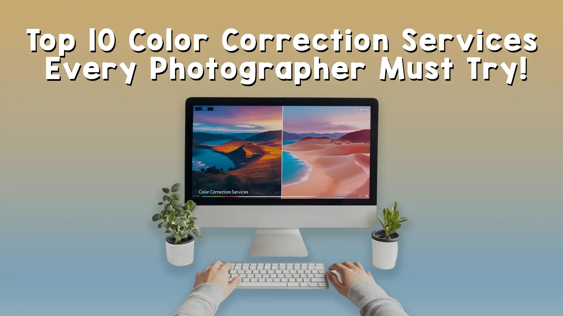
Real-World Examples of Product Photography Color Correction
Let’s see product photography color correction in action with a couple of examples. Picture a ceramic mug photographed indoors under warm lighting. The raw image might show a yellowish cast, making the white glaze look creamy instead of crisp. Start by setting the white balance with the eyedropper on the mug’s surface to neutralize the tone. Then, boost the contrast slightly to make the edges pop, and increase the blue luminance to enhance any design details. The result? A clean, bright mug that looks true to life and ready to sell.
Now imagine a pair of sneakers shot outdoors on an overcast day. The colors might look muted, with the red stripes appearing dull and the white base grayish. Begin with exposure and contrast adjustments to lift the overall brightness, then use HSL to target the red—upping its saturation and tweaking the hue for accuracy. Finally, correct the white base by cooling the temperature slightly. This kind of product photography color correction turns a lackluster shot into a vibrant, attention-grabbing one.
These examples highlight how product photography color correction adapts to each image’s needs. It’s not about applying the same formula every time—it’s about understanding what the product requires to shine.

Tips to Practice and Perfect Product Photography Color Correction
Mastering product photography color correction takes time, but practice makes it second nature. Start with simple images—like a single product on a plain background—and focus on getting the white balance and exposure right. As you gain confidence, move to trickier shots with multiple colors or reflective surfaces. Experiment with different lighting setups during the shoot, then correct them in post to see how your edits change the outcome.
Studying your tools is another smart move. Spend time exploring every feature in your software—whether it’s Photoshop’s color balance or Lightroom’s tone curve. Presets can also speed up your workflow; many programs offer free ones you can tweak for product photography color correction. Over time, you’ll develop an eye for what works and build your own custom settings.
Feedback helps too. Share your corrected images with peers or clients to get their take. What looks perfect to you might need a tweak for someone else’s eyes. Online communities or resources like the Image Work India blog can offer inspiration and tips to refine your skills. The more you edit, the better you’ll get at spotting and fixing color issues.
Boost Your Business with Image Work India’s Editing Services
By now, you’ve got a toolbox full of techniques for product photography color correction, from basic tweaks to advanced edits. But let’s face it—running a business or managing a photoshoot leaves little time for perfecting every image. That’s where Image Work India comes in. We’re experts in image editing, offering top-notch product photography color correction to make your photos pop without the hassle. Whether you need a quick fix or a full overhaul, our team delivers results that impress customers and drive sales.
Head over to Image Work India to see how we can help. Our services cover everything from color correction to background removal, all tailored to your needs. Let us take your product images from good to great, so you can focus on growing your brand. With Image Work India, stunning visuals are just a click away.