Wedding photography is all about capturing those magical moments—the first kiss, the joyful tears, the laughter during the reception. But what truly brings those images to life is wedding photography color grading. If you’re new to editing wedding photos, you might wonder what color grading is and why it matters. Simply put, wedding photography color grading is the process of adjusting the colors, tones, and moods in your photos to make them look polished and unforgettable. It’s not just about fixing flaws; it’s about creating a vibe that matches the couple’s big day. In this beginner’s guide, we’ll walk you through everything you need to know about wedding photography color grading, from the basics to pro-level tips, so you can create stunning edits that wow your clients.
What Is Wedding Photography Color Grading?
Let’s start with the foundation. Wedding photography color grading is the art of tweaking the colors in your wedding images to enhance their beauty and tell a story. Imagine a photo of a bride in her white dress under golden sunlight. Without color grading, the image might look flat or washed out. But with wedding photography color grading, you can make the sunlight glow warmer, the dress pop brighter, and the background feel dreamy. It’s like adding a filter, but with way more control. This process happens after you’ve done basic edits—like adjusting exposure or cropping—and it’s where your creativity really shines.
Color grading isn’t just random adjustments, though. It’s about consistency and style. For wedding photographers, wedding photography color grading helps create a signature look. Maybe you love soft pastels for a romantic feel, or maybe bold contrasts suit your vibe. Whatever your style, understanding wedding photography color grading is key to making every photo in an album feel connected, like pieces of one beautiful puzzle.

Why Wedding Photography Color Grading Matters
You might be thinking, “Can’t I just slap on a preset and call it a day?” Sure, presets are a great starting point, but wedding photography color grading takes your work to the next level. Weddings are emotional, and the colors in your photos should reflect that. A bright, sunny ceremony might call for vibrant hues, while an evening reception could shine with moody, deep tones. Wedding photography color grading lets you match the mood of the moment, making the images feel alive.
Plus, couples notice the details. They’ve spent months planning their wedding—choosing flowers, dresses, and decor with specific colors in mind. When you use wedding photography color grading to highlight those choices, it shows you care about their vision. A well-graded photo doesn’t just look good; it feels personal. And in a competitive field like wedding photography, standing out with gorgeous, cohesive edits can make all the difference.

Tools You’ll Need for Wedding Photography Color Grading
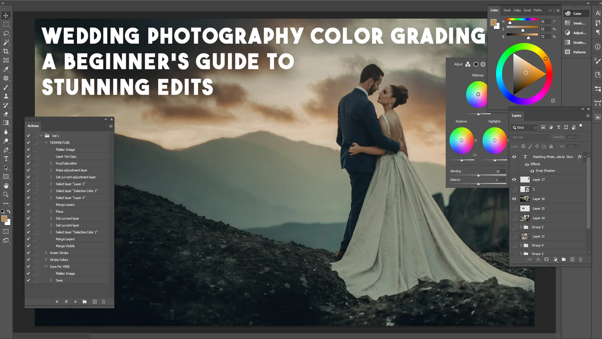
Before you dive into wedding photography color grading, you’ll need the right tools. The good news? You don’t need to break the bank to get started. Most beginners use software like Adobe Lightroom or Photoshop, which are industry standards for a reason. Lightroom is perfect for batch editing (think hundreds of wedding photos at once), while Photoshop offers more detailed control for tricky shots. Both have powerful tools for wedding photography color grading, like sliders for hue, saturation, and luminance.
If you’re not ready for paid software, free options like GIMP or mobile apps like Snapseed can work too. They’re simpler but still let you play with colors. You’ll also want a decent monitor—nothing fancy, just something that shows colors accurately. Wedding photography color grading is all about precision, so a screen that’s too bright or too dim can throw off your edits. Once you’ve got your setup, you’re ready to start experimenting.

Getting Started with Wedding Photography Color Grading
So, how do you actually begin wedding photography color grading? First, open your photo in your chosen software and finish the basic edits—fix the exposure, adjust the white balance, straighten the horizon. These steps ensure your image is solid before you add creative flair. Once that’s done, it’s time to focus on wedding photography color grading.
Start with the white balance. This sets the temperature of your photo—warm (yellow/orange) or cool (blue). For outdoor weddings, a warm tone often feels inviting, while indoor shots might need a cooler tweak to balance artificial lighting. Next, play with the contrast and brightness. Boosting contrast can make colors pop, which is great for dramatic shots like the couple’s first dance. Wedding photography color grading is about finding that sweet spot where the image feels natural but enhanced.
Now, move to the color sliders. In Lightroom, you’ll see options for hue (the shade of a color), saturation (how intense it is), and luminance (how bright it is). Let’s say the groom’s suit is a rich navy. You could tweak the blue hue to make it stand out against the greenery, then dial up the saturation for impact. Wedding photography color grading lets you decide what deserves attention in each frame.
Creating a Mood with Wedding Photography Color Grading
One of the coolest parts of wedding photography color grading is setting the mood. Colors speak to emotions—soft pinks and lavenders feel romantic, while deep greens and golds feel timeless. Think about the wedding you’re editing. Was it a rustic barn celebration or a sleek city affair? Wedding photography color grading can reflect that vibe.
For a rustic wedding, try warming up the tones and desaturating harsh colors for a vintage look. If the couple had a modern black-tie event, sharp contrasts and cool tones might fit better. You can even split-tone your images—adding a warm tint to highlights and a cool tint to shadows—for a cinematic effect. Wedding photography color grading isn’t just technical; it’s storytelling through color.
Experimenting is key here. Don’t be afraid to push the sliders and see what happens. Maybe you’ll discover that a slight teal shift in the shadows makes the bride’s bouquet pop. The more you practice wedding photography color grading, the more you’ll trust your instincts.

Common Mistakes to Avoid in Wedding Photography Color Grading
Beginners often stumble when they first try wedding photography color grading, and that’s okay—it’s part of learning. One big mistake is overdoing it. Cranking the saturation too high can make skin tones look unnatural, turning the bride into an orange blur. Subtlety is your friend; wedding photography color grading should enhance, not overpower.
Another trap is inconsistency. If one photo has warm, golden tones and the next is cool and blue, the album won’t flow. Stick to a palette that ties the set together. You can tweak individual shots, but the overall feel should match. Finally, don’t skip calibrating your monitor. If your screen shows colors wrong, your wedding photography color grading will be off, and prints might disappoint.

Using Presets to Speed Up Wedding Photography Color Grading
Time is precious when you’re editing hundreds of wedding photos. That’s where presets come in. A preset is a pre-made set of adjustments you can apply with one click—think of it as a recipe for wedding photography color grading. You can find free or paid presets online, or create your own once you’ve nailed your style.
Start with a preset that matches the wedding’s vibe—say, “Bright and Airy” for a summer day or “Moody Romance” for a candlelit reception. Then tweak it. Maybe the preset makes the greens too vibrant; just dial them back. Presets save time, but wedding photography color grading still needs your personal touch to shine.
Advanced Techniques in Wedding Photography Color Grading
Once you’ve got the basics down, it’s time to level up your wedding photography color grading skills. Advanced techniques can transform good photos into breathtaking ones, and they’re not as hard as they sound. One powerful tool is the tone curve. In software like Lightroom or Photoshop, the tone curve lets you adjust shadows, midtones, and highlights separately. For example, lifting the shadows can brighten a dimly lit ceremony shot without washing out the bride’s dress. Wedding photography color grading with the tone curve gives you precision that sliders alone can’t match.
Another trick is selective color editing. Let’s say the couple’s wedding had a signature color, like burgundy in the flowers and ties. With selective editing, you can boost just the reds to make those details pop, while keeping the rest of the image balanced. Wedding photography color grading isn’t just about the whole photo—it’s about guiding the viewer’s eye to what matters. You can also use the HSL panel (Hue, Saturation, Luminance) to fine-tune specific colors. If the grass looks too neon, dial back the green saturation. It’s these small tweaks that make your edits look professional.
Layering adjustments is another pro move. Start with a base grade—say, a warm, soft look—then add a subtle vignette to draw focus inward. Wedding photography color grading often involves stacking effects like this to build depth. Don’t rush; take your time to see how each layer changes the mood. The goal is a polished image that still feels natural.

Wedding Photography Color Grading for Different Lighting Conditions
Weddings happen in all kinds of light—harsh noon sun, golden hour glow, or tricky indoor bulbs. Wedding photography color grading adapts to these conditions to keep your photos stunning. For bright outdoor shots, you might need to tame highlights so the sky doesn’t blow out. Cool down the blues slightly and warm up the skin tones to keep everyone looking radiant. This balancing act is a big part of wedding photography color grading—it ensures the couple stands out, not the weather.
Golden hour is a photographer’s dream, and wedding photography color grading can make it even better. Enhance the oranges and yellows for that dreamy, sun-kissed feel, but watch the shadows—too much warmth can muddy them. Indoor lighting, like from chandeliers or fluorescents, can be trickier. Tungsten lights cast an orange glow, so you might cool the image and boost contrast to cut through the haze. Wedding photography color grading here is about correcting flaws while keeping the ambiance cozy.
What about night shots? Think sparklers or a starry exit. Crank up the contrast and deepen the blacks for drama, then add a hint of blue to the shadows for a magical touch. Wedding photography color grading adjusts to every scenario, turning challenges into opportunities.
Real-Life Examples of Wedding Photography Color Grading
Let’s bring this to life with some examples. Imagine a beach wedding at sunset. The raw photo might show a flat orange sky and pale sand. With wedding photography color grading, you warm the highlights to make the sunset glow, boost the teal in the waves for contrast, and slightly desaturate the sand for a soft, clean look. The result? A photo that feels like summer love, with the couple framed perfectly against the scene.
Now picture a winter wedding in a snowy forest. The unedited shot might look cold and gray. Through wedding photography color grading, you add a subtle blue tint to the snow for a crisp feel, warm the couple’s skin tones so they don’t blend in, and increase contrast to make the trees pop. Suddenly, it’s a fairytale moment. These examples show how wedding photography color grading isn’t one-size-fits-all—it’s tailored to the story you’re telling.
Or consider a rainy wedding. The raw image might be dark and dull, with muddy colors. Adjust the exposure first, then use wedding photography color grading to brighten the greens of wet leaves and add a soft glow to the couple’s umbrella. A slight vignette keeps the focus on them. What was a gloomy day becomes romantic and intimate, all thanks to thoughtful color grading.

Building Your Own Wedding Photography Color Grading Style
Every photographer has a unique voice, and wedding photography color grading is where you find yours. Start by studying your favorite wedding photos—what colors draw you in? Maybe you love the muted elegance of film-inspired edits, or the bold punch of modern vibes. Play with different looks until something clicks. Wedding photography color grading is your chance to stand out in a crowded market.
Consistency is key to a signature style. Once you find a look—say, warm tones with soft shadows—apply it across your portfolio. Clients will start recognizing your work, and that’s gold for your brand. You can still tweak for each wedding’s vibe, but a cohesive thread ties it all together. Wedding photography color grading becomes your artistic fingerprint.
Don’t be afraid to evolve, though. As you grow, your taste might shift from bright and airy to rich and moody. Keep experimenting—try new presets, test bold edits, see what resonates. Wedding photography color grading is a journey, and the more you explore, the stronger your skills get.

Saving Time with Wedding Photography Color Grading Workflows
Weddings mean hundreds of photos, and editing them one by one is a slog. A smart workflow makes wedding photography color grading faster without sacrificing quality. Start by sorting your images—pick the keepers, then edit a few hero shots (like the kiss or cake cutting) to nail your look. Once you’re happy, save those settings as a custom preset. Apply it to the rest of the batch, then tweak as needed.
Syncing edits in Lightroom is a lifesaver here. Adjust one photo, sync the settings across similar shots (like all the ceremony pics), and you’ve cut your workload in half. Wedding photography color grading doesn’t have to be a grind—work smarter, not harder. And if you’re swamped, outsourcing to pros like Image Work India can handle the heavy lifting, leaving you free to shoot more weddings.

Elevate Your Edits with Image Work India
By now, you’re probably excited to try wedding photography color grading yourself. But let’s be real—mastering it takes time, and deadlines don’t wait. That’s where Image Work India comes in. At Image Work India, we specialize in image editing services that make your wedding photos shine. Whether you need help with wedding photography color grading, retouching, or full album edits, our team delivers stunning results fast.
Why stress over edits when you can focus on capturing love stories? Visit Image Work India to see how we can transform your raw shots into masterpieces. Our experts understand wedding photography color grading inside and out, ensuring every image matches your vision. Plus, we’re affordable and quick—perfect for busy photographers. Let us handle the edits while you grow your business.
Final Thoughts on Wedding Photography Color Grading
Wedding photography color grading is more than a technical step—it’s the heart of turning moments into memories. From basic adjustments to advanced techniques, it’s about enhancing beauty, setting moods, and telling stories. Whether you’re warming up a sunset kiss or cooling down a snowy vow exchange, wedding photography color grading gives you the power to create something unforgettable.
Start simple—play with sliders, try presets, learn your tools. As you grow, refine your style and build workflows that save time. And when you need a boost, Image Work India is here to help. With practice and the right support, your wedding photography color grading skills will turn every album into a work of art. So grab your camera, shoot that next wedding, and let your edits bring the magic to life.