Color grading photos in Lightroom is one of the most effective ways to enhance your images, giving them a professional and cinematic look. Whether you’re a photographer, content creator, or simply someone who loves editing photos, mastering the art of color grading can dramatically improve your work. This guide will walk you through the process of color grading photos in Lightroom, offering expert tips, techniques, and practical advice on how to elevate your images to a whole new level.
What is Color Grading in Lightroom?
Color grading photos in Lightroom refers to the process of adjusting the colors and tones in an image to create a specific aesthetic or mood. It involves tweaking parameters like exposure, contrast, saturation, and temperature to achieve a desired look, whether it’s a vintage, dramatic, or cinematic effect. By carefully manipulating the color and tonal values, you can transform an ordinary photo into something that looks professionally edited, with depth and emotion.
Lightroom offers a variety of powerful tools that help with color grading, from the basic sliders in the Develop module to advanced options like split toning and the HSL panel. While color grading might sound like a complex process, anyone can learn how to do it with a bit of practice and patience. The best part is, Lightroom makes this process accessible to both beginners and professionals alike.

Why Color Grading Photos in Lightroom is Important
Before diving into the steps, it’s essential to understand why color grading photos in Lightroom is so important. Color grading can completely transform the mood and feel of your images. For example, warm tones can evoke feelings of nostalgia or comfort, while cooler tones might make the image feel more modern and sleek. Color grading allows you to tell a story through your photos, making them more visually engaging.
Additionally, color grading helps create a consistent look across a series of images, which is particularly useful for photographers working on a specific project, such as a photo shoot or a brand campaign. By learning how to color grade photos in Lightroom like a pro, you can ensure that all your images have a cohesive visual style, which is crucial for maintaining a professional portfolio.
Getting Started with Color Grading Photos in Lightroom
To begin color grading photos in Lightroom, you first need to have the right tools and settings. Lightroom is a powerful software that provides a variety of features designed specifically for photo editing. Here’s a quick overview of the key areas you’ll use for color grading:
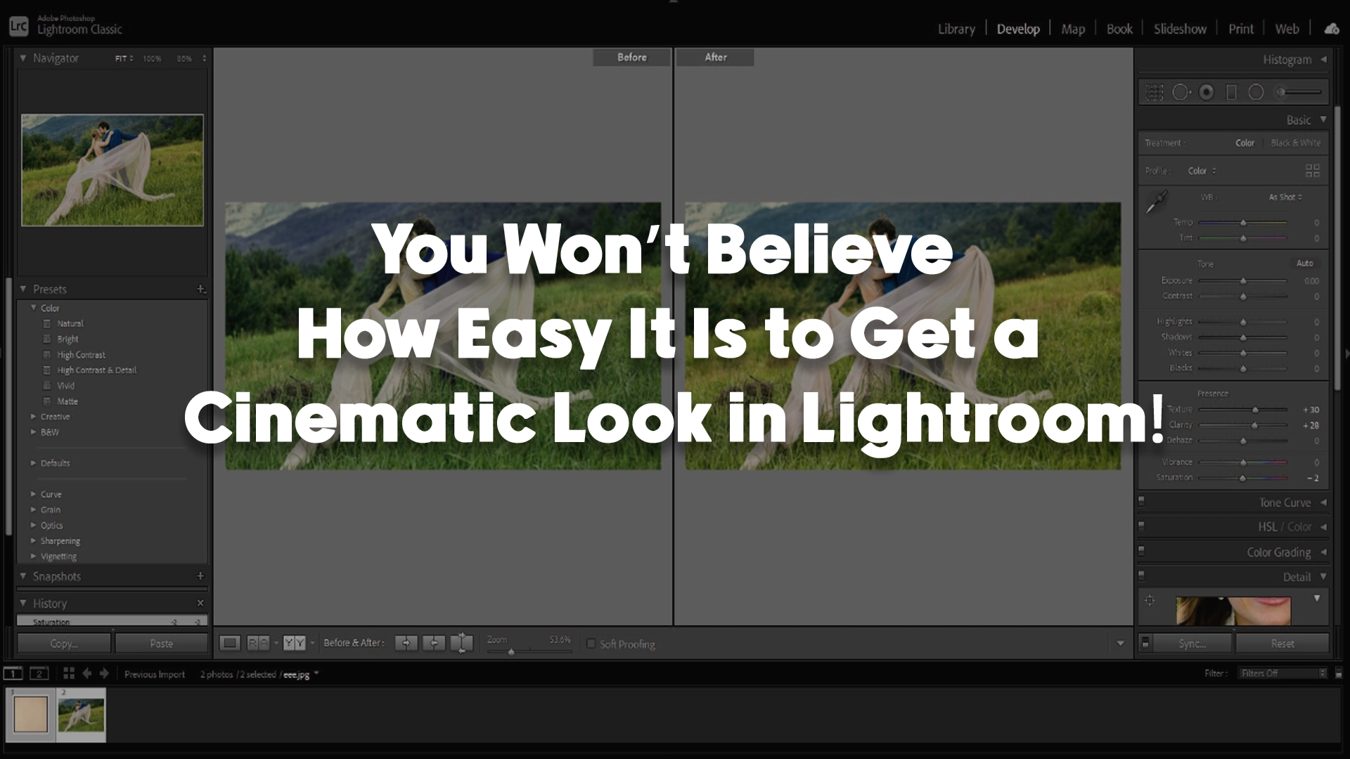
- Develop Module: This is where you’ll make most of your color grading adjustments. It includes sliders for exposure, contrast, highlights, shadows, whites, and blacks, as well as more advanced controls like the HSL panel and Split Toning.
- HSL Panel: HSL stands for Hue, Saturation, and Luminance. The HSL panel allows you to adjust the colors in your image individually, giving you precise control over each color channel. This is one of the most powerful tools when color grading photos in Lightroom, as it lets you tweak specific hues without affecting the rest of the image.
- Split Toning: Split toning adds different color hues to the highlights and shadows of your image, allowing you to create a unique color palette. This is an essential technique in achieving cinematic looks, where specific color schemes are often used in movies to convey emotions and set the mood.
- Tone Curve: The tone curve is another essential tool for color grading photos in Lightroom. By adjusting the curve, you can fine-tune the brightness and contrast of your image, creating deep shadows and bright highlights that are key to cinematic looks.
Basic Color Grading Techniques in Lightroom
Once you’re familiar with Lightroom’s tools, it’s time to explore some basic techniques for color grading photos. Here are some steps you can follow to start color grading photos in Lightroom like a pro:

1. Start with White Balance Adjustments
The first thing to consider when color grading photos in Lightroom is the white balance. White balance determines the color temperature of your image, making it warmer or cooler depending on the lighting conditions.
To get started, adjust the Temperature and Tint sliders in the Basic panel. If your photo looks too blue (cold), increase the temperature to warm it up. If it’s too orange (warm), decrease the temperature to cool it down. The goal is to make the photo look natural and balanced, but this is also a great place to set the tone for your cinematic style. For instance, warmer images can evoke a nostalgic, vintage vibe, while cooler images can feel more modern and sleek.

2. Adjust Contrast and Exposure
After you’ve set the white balance, the next step is to work on contrast and exposure. Adjusting these settings is crucial for creating depth in your images. Increasing contrast makes the light areas brighter and the dark areas darker, adding drama to the photo. In a cinematic look, higher contrast can help add emphasis to key areas of the image.
You can use the exposure slider to brighten or darken the entire image. However, be mindful not to overexpose or underexpose the image too much. You want to preserve the details in both the highlights and shadows. The goal is to find the right balance to give the image that cinematic, balanced look.

3. Manipulate the Shadows and Highlights
The next step in color grading photos in Lightroom is adjusting the shadows and highlights. The shadows represent the darkest areas of your image, while the highlights are the brightest. To achieve a cinematic look, you can reduce the shadows slightly to add more contrast or boost them to bring out hidden details. For a more dramatic, moody effect, lowering the shadows will give your image a darker, more mysterious feel.
On the other hand, adjusting the highlights can help you recover any overexposed areas, preventing details from being lost in bright spots. You can also play around with the whites and blacks sliders to fine-tune the brightness levels further.

4. Work with the HSL Panel
The HSL (Hue, Saturation, Luminance) panel is one of the most powerful tools for color grading photos in Lightroom. It allows you to adjust the individual colors in your image, creating more specific looks. For example, you can desaturate certain colors to make them less intense or boost the saturation of other colors to make them pop.
If you want to create a cinematic look, you might want to adjust the hues of certain colors to match the color grading style you’re aiming for. For example, increasing the red or orange hues in the image can give it a warm, sunset-like appearance, which is commonly seen in cinematic photography. Alternatively, you can adjust the blues or greens to create cooler, more moody tones.

5. Use Split Toning for Cinematic Effects
One of the hallmarks of cinematic photography is the use of split toning, which involves applying different colors to the shadows and highlights. In Lightroom, this is done through the Split Toning panel.
To achieve a cinematic look, you might want to add warm tones to the highlights (like soft yellows or oranges) and cool tones to the shadows (such as teal or blue). This “teal and orange” look is incredibly popular in movies and can help give your photos that movie-like quality. Split toning is a powerful technique that adds depth and interest to your images, making them feel more cinematic and visually striking.
Advanced Techniques for Color Grading Photos in Lightroom
Once you’ve mastered the basics of color grading photos in Lightroom, you can move on to more advanced techniques that will elevate your work even further. These techniques require a bit more experimentation and a good understanding of Lightroom’s tools, but they can help you achieve truly stunning, professional results.

1. Use the Tone Curve for Fine-Tuning
The tone curve is an advanced tool that allows you to adjust the overall tonal range of your image. It’s a great way to enhance the contrast and brightness of your photo while keeping the details intact. To achieve a cinematic look, you can create an “S” curve, which deepens the shadows and brightens the highlights. This gives your photo that signature cinematic look with rich, detailed shadows and vibrant highlights.
2. Create a Color Palette with the HSL Panel
As you become more familiar with color grading photos in Lightroom, you can start to experiment with more complex color palettes. The HSL panel allows you to make very specific adjustments to individual colors in your image. For example, if you want a retro look, you can push the reds and oranges towards warmer tones, while desaturating the greens and blues. Conversely, if you’re going for a cold, modern look, you might want to push the blues and teals and reduce the reds and yellows.

3. Use Presets for Consistency
Presets are a great way to apply a consistent color grading style across multiple images. Lightroom has a variety of built-in presets, and there are plenty of third-party options available as well. You can create your own presets after you’ve perfected a color grading style you like, which can save you time in future projects. Presets are especially helpful if you’re working on a series of photos that need to have the same cinematic look.
Conclusion: Color Grading Photos in Lightroom Like a Pro
Color grading photos in Lightroom is a powerful way to enhance your images and give them a cinematic, professional look. By adjusting basic settings like white balance, exposure, and contrast, as well as using advanced techniques like split toning and the HSL panel, you can achieve stunning results that truly make your photos stand out. With practice and experimentation, you’ll soon be able to color grade photos in Lightroom like a pro, adding your own unique touch to every image you edit.
If you need help with color grading or any other image editing tasks, Image Work India offers expert photo editing services tailored to your needs. Our team of skilled professionals can help you transform your photos into stunning works of art. Visit Image Work India today to learn more about our services!