Color grading is one of the most important aspects of photo editing, allowing photographers and designers to bring their creative vision to life. Adobe Lightroom, a powerful editing tool, offers various color grading features that enable users to enhance their images and achieve a professional, polished look. If you’re new to color grading in Lightroom and wondering how to get started, this guide will walk you through the entire process, from understanding the basics to mastering the advanced techniques. Whether you’re looking to improve your images for personal projects or as part of your professional workflow, Adobe Lightroom color grading is a valuable skill that can transform your photos.
What is Adobe Lightroom Color Grading?
Adobe Lightroom color grading is the process of adjusting and modifying the colors in an image to achieve a desired mood, tone, or style. Unlike basic adjustments such as exposure or contrast, color grading focuses on fine-tuning specific color elements to create a particular effect. This could range from making an image feel warmer, cooler, or more dramatic, to enhancing skin tones or adding a vintage or cinematic effect.
Lightroom’s color grading features provide a robust set of tools to help photographers control the color output of their images. Through its intuitive interface, you can manipulate shadows, midtones, and highlights, adjusting the colors within each of these tonal ranges to create harmony or contrast, depending on your vision.

Why Use Adobe Lightroom for Color Grading?
When compared to other photo editing software, Adobe Lightroom stands out as a favorite choice among photographers and image editors. This is due to its combination of simplicity, powerful tools, and non-destructive editing. Adobe Lightroom color grading allows you to refine your photos without altering the original file, which is perfect for professionals who need to maintain high-quality images.
Moreover, Lightroom’s color grading tools give you complete control over every element of an image’s color spectrum. Whether you’re aiming for subtle adjustments or dramatic transformations, Lightroom makes it easy to achieve results. In addition, Lightroom supports batch processing, which means you can apply color grading to multiple images at once, saving time and improving efficiency, especially in high-volume workflows.

Getting Started with Adobe Lightroom Color Grading
Before diving into the advanced techniques, it’s important to familiarize yourself with the interface and the tools you’ll be using. Adobe Lightroom color grading is accessible within the “Develop” module, where you’ll find several sliders that allow you to adjust various parameters of the image.
- Basic Panel Adjustments: The first step in color grading is to make sure your image is properly exposed and balanced. Start by adjusting the exposure, contrast, whites, and blacks to set the foundation. Once these settings are adjusted to your liking, you can move on to the more detailed color grading steps.
- Tone Curve Adjustments: One of the most powerful tools for color grading in Adobe Lightroom is the Tone Curve. This allows you to fine-tune the brightness and contrast in specific tonal ranges of the image. The Tone Curve has three sections: Shadows, Midtones, and Highlights, which gives you the flexibility to adjust the image’s light and dark areas individually. By making subtle curve adjustments, you can change the overall tone and feel of the image, creating a more dramatic or softer effect.

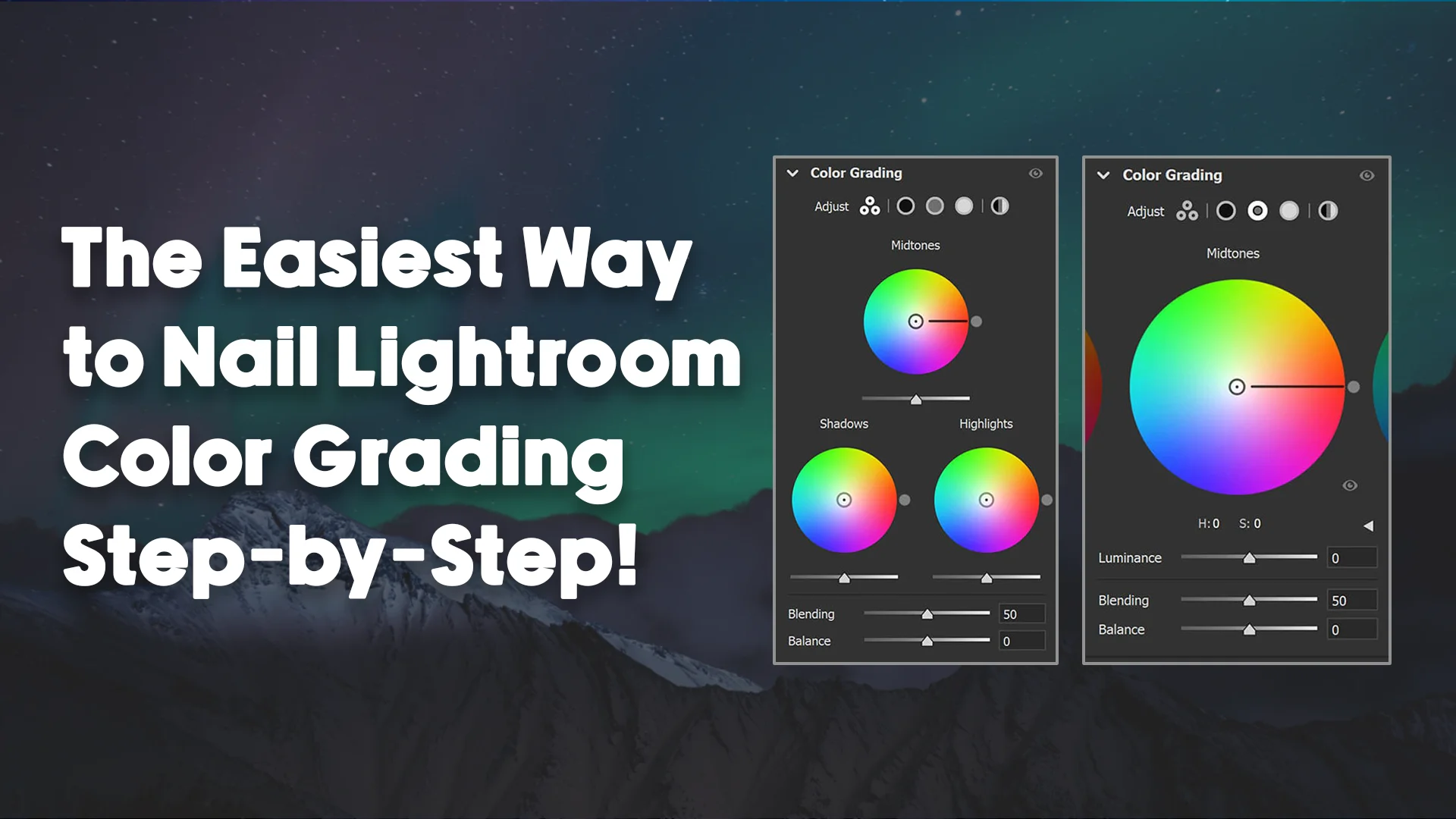
Adobe Lightroom Color Grading Tools: A Detailed Look
After mastering the basic adjustments, you’ll want to explore the color grading tools in more detail. Adobe Lightroom’s color grading panel is divided into three sections: Shadows, Midtones, and Highlights. Each section contains color sliders that allow you to adjust the hue, saturation, and luminance of each tonal range.
- Shadows: The shadow tones in an image refer to the darker areas, where the light barely touches. Adjusting the color of the shadows can create a moody or atmospheric feel. By pushing the shadows toward cooler tones like blues and greens, or warmer tones like reds and yellows, you can dramatically alter the mood of the image. This is particularly useful for creating dramatic effects or adding a sense of depth to the image.
- Midtones: The midtones are the range between shadows and highlights. These tones represent the majority of the image, making it one of the most important areas to focus on when color grading. In Adobe Lightroom color grading, adjusting the midtones can bring out more natural colors, enhance skin tones, or create a balanced overall look. Since this range holds the most color information, it’s key to fine-tune the hues and saturation for the most impactful changes.
- Highlights: Highlights refer to the brightest areas of the image. Adjusting the highlights can help you create a sense of light and contrast in the image. Lighter tones can be enhanced with warmer colors like yellows and oranges, which can add a sunlit effect to the image. Alternatively, cooler highlights can be achieved by shifting the color balance towards blues and purples, which can create a more subdued, moody atmosphere.
- Global Color Adjustments: In addition to the shadow, midtone, and highlight adjustments, Lightroom also allows you to apply global color adjustments using the HSL/Color panel. This panel gives you control over the Hue, Saturation, and Luminance of specific colors in the image. For example, if you want to enhance the green tones in a landscape photo or shift the color of the sky to a warmer hue, the HSL panel provides the tools to do so.

Advanced Adobe Lightroom Color Grading Techniques
Now that you’re familiar with the basics of Adobe Lightroom color grading, you can experiment with some advanced techniques to take your editing to the next level.
- Split Toning: Split toning is a technique that involves adding different colors to the highlights and shadows of an image. This technique can give your photo a vintage or cinematic look, making it appear more stylized. In Lightroom, you can use the Split Toning panel to add specific colors to the shadow and highlight areas separately. You can also control the balance between the two, giving you the freedom to experiment with different looks and creative effects.
- Color Grading Presets: If you’re looking for a quick and easy way to apply a particular style to your images, Adobe Lightroom offers an array of color grading presets. These presets are pre-configured settings that adjust the color grading to create specific looks, such as black and white, vintage, or film-inspired tones. Presets can save time when you’re working with large batches of photos, and they can also provide inspiration if you’re unsure of which direction to take your color grading.
- Using the Graduated Filter and Radial Filter: Lightroom’s Graduated Filter and Radial Filter are powerful tools for applying color grading to specific areas of an image. The Graduated Filter is useful when you want to apply a gradient of color or exposure changes to a section of the photo, such as the sky in a landscape image. Similarly, the Radial Filter allows you to focus color adjustments on specific areas, like a subject’s face or a focal point in the image, creating a spotlight effect.
The Importance of Color Grading for Photographers
Adobe Lightroom color grading is not just a tool for enhancing aesthetics; it also plays a critical role in conveying a message or emotion through your images. Whether you’re working on portraits, landscapes, product photography, or event shots, color grading can help you create a narrative and guide the viewer’s eye to important elements of the composition. With the ability to manipulate light and color, Lightroom allows you to emphasize details, create a specific atmosphere, and enhance the story you want your image to tell.
For photographers, color grading in Lightroom can be a game-changer when it comes to differentiating your work and establishing a unique style. By mastering color grading techniques, you can create a signature look that resonates with your audience and sets your images apart from the competition.

How Adobe Lightroom Color Grading Enhances Your Workflow
One of the most significant benefits of mastering Adobe Lightroom color grading is how it can improve your workflow. Whether you’re working on a single image or a large batch, color grading is a task that demands precision, consistency, and efficiency. Lightroom’s intuitive interface and powerful tools make it possible to make detailed adjustments quickly without interrupting your workflow.
For example, if you’re editing a series of product images for an e-commerce website, using color grading can help you maintain consistency across all photos. Applying similar color tones to the entire set of images creates a cohesive look that enhances the professionalism of your product presentations. Similarly, if you’re working on a client project with multiple photos, applying a consistent color grading style can help ensure that the final collection feels unified.
Furthermore, Lightroom allows you to save and apply your custom settings, making it easier to use the same color grading on future projects. By creating your own preset or using one of the many available online, you can save time and reduce repetitive tasks while maintaining a consistent style across your photos.
Understanding the Role of Color in Photography and Design
Color plays an essential role in photography and design. It’s not just about making an image look aesthetically pleasing—it’s also about creating a specific mood or feeling. For instance, warm tones such as reds, oranges, and yellows can evoke feelings of warmth, happiness, or energy, while cooler tones like blues and greens can make an image feel calm, peaceful, or even melancholic.
Adobe Lightroom color grading allows you to manipulate the color palette of your images to match the mood or message you want to convey. For photographers, understanding how different colors interact can help you make more informed choices during the editing process. For instance, if you’re editing a portrait, adjusting the skin tones and background colors can greatly impact the overall aesthetic and storytelling of the image.
Similarly, for designers working with product photos, color grading helps in presenting the product in its best light, emphasizing its features, and creating a visual connection with the target audience. Different industries, such as fashion, real estate, and food, require specific color grading techniques to highlight textures, colors, and other elements that help customers make purchase decisions. The ability to manipulate color in Adobe Lightroom with precision ensures that designers can maintain a consistent brand aesthetic across their work.

Mastering Adobe Lightroom Color Grading for Portrait Photography
Portrait photography is one of the most common types of photography that benefits greatly from color grading. The subtle adjustments to skin tones and backgrounds can completely transform a portrait, making it feel warmer, cooler, more natural, or more stylized. When editing portraits in Adobe Lightroom, there are several key color grading techniques that can help you achieve a professional look.
First, focus on enhancing skin tones. Lightroom’s color grading tools allow you to adjust the hues and saturation of midtones, which is where the majority of skin tones fall. By slightly shifting the color balance towards warmer hues, such as oranges or reds, you can give the subject a healthy, glowing appearance. If the skin tones are too red or too yellow, you can adjust the hue to correct them.
Next, focus on the background and other elements in the portrait. By adjusting the shadows and highlights, you can make the subject stand out more, creating a sense of depth. Using the Radial Filter or Graduated Filter, you can selectively adjust the color grading to the background, isolating the subject from any distractions and ensuring that the focus remains on them.
Finally, you may want to experiment with creative color grading techniques, such as split toning. By adding different hues to the highlights and shadows of a portrait, you can create unique lighting effects. For instance, adding warm tones to the highlights and cooler tones to the shadows can create a vintage or cinematic look, which can help tell a more compelling story in the photograph.

Adobe Lightroom Color Grading for Landscape Photography
When it comes to landscape photography, color grading plays a critical role in creating atmosphere and emphasizing the natural beauty of the scene. Whether you’re capturing a serene sunset, a dramatic mountain range, or a lush forest, color grading in Adobe Lightroom helps you bring out the rich colors and fine details that make landscapes come to life.
In landscape photography, the first step in color grading is to correct the white balance. Often, outdoor photos may have a slight color cast, especially if the image was taken during the golden hour or under cloudy conditions. Adobe Lightroom allows you to adjust the white balance to neutralize any unwanted color casts and ensure that the colors in the image are accurate and true to life.
Once you have the basic adjustments in place, focus on enhancing the colors of the image. Adjust the shadows, midtones, and highlights individually to bring out the richness in the landscape. If you’re working with a sunset or sunrise photo, adding warm tones to the highlights can enhance the colors of the sky, while boosting the greens or blues in the shadows can bring out the richness of the natural environment.
You can also experiment with color grading techniques like split toning or using the HSL/Color panel to fine-tune the hues, saturation, and luminance of specific colors. For example, increasing the saturation of the greens can make foliage appear more vibrant, while decreasing the blues in the sky can reduce any distractions and create a more focused image.

Adobe Lightroom Color Grading for Product Photography
Product photography requires a high level of attention to detail, especially when it comes to lighting and color. Color grading can make a huge difference in how products are presented to potential customers. By enhancing the colors of the product and its surroundings, you can highlight features and create an appealing visual experience that encourages purchase decisions.
When color grading product images in Lightroom, the first step is to ensure that the product is accurately represented. This means adjusting the white balance and making sure that the product’s true colors are visible. Once that’s done, you can enhance the image by adjusting the overall tone and adding creative touches.
For example, if you’re shooting a fashion item, you can enhance the richness of the fabric by adjusting the midtones to bring out its texture and color. Similarly, for a food product, you can use Lightroom’s color grading tools to make the food look more appetizing by adjusting the saturation of the reds, yellows, and greens to make the product pop.
The key to successful product photography color grading in Adobe Lightroom is to keep the image true to the product while adding just enough enhancement to make it visually appealing. A balanced approach ensures that the product is the focal point, and the color grading supports its visual appeal without overpowering it.
Why Image Work India is Your Go-To Service for Adobe Lightroom Color Grading
At Image Work India, we specialize in providing high-quality image editing services, including Adobe Lightroom color grading. Whether you’re a photographer looking to perfect your portfolio, a business aiming to enhance product images, or someone looking for professional assistance with portrait and landscape photography, our team of skilled editors is here to help.
Our experts understand the nuances of color grading and use Adobe Lightroom to bring out the best in your photos. With years of experience in the industry, we can work with you to achieve the exact look and feel you’re aiming for, whether it’s a natural, true-to-life color grading or a more artistic, stylized effect.
Explore our range of services today at Image Work India and see how we can elevate your images to a new level of professionalism.