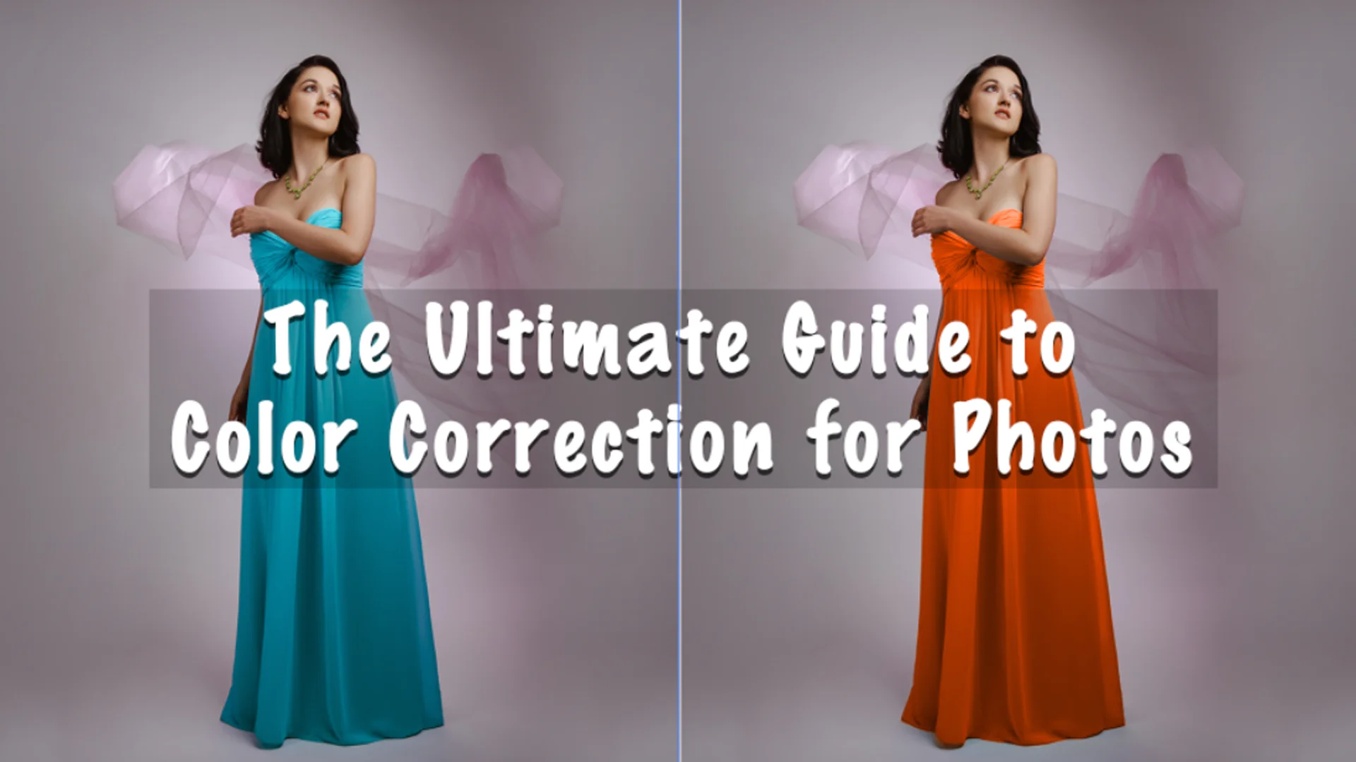
Color correction for photos is an essential skill for photographers, graphic designers, and anyone working with digital images. The accuracy and vibrancy of color can make a significant difference in how a photo is perceived, whether it’s for personal use, marketing, or professional portfolios. Color correction is not just about making a photo look good but also about ensuring that the colors are true to life or adjusted to create a specific mood or atmosphere.
In this ultimate guide to color correction for photos, we’ll explore the key concepts, tips, techniques, and tools you can use to perfect your images. Whether you’re a beginner or a seasoned professional, this article will help you understand the process and its importance. We’ll also compare different tools and services, so if you’re looking for professional help, you can make an informed decision. So, let’s dive into the world of color correction for photos!
Understanding Color Correction for Photos
Before we start discussing techniques and tips, let’s first understand what color correction for photos is all about. Color correction refers to the process of adjusting the colors in an image to make them more accurate or appealing. It can involve everything from adjusting the white balance to tweaking exposure levels, saturation, and contrast. The goal is to ensure that the colors look natural, vibrant, and aligned with the subject matter or the intended style of the image.
When you capture a photo, the camera’s sensor interprets the colors based on its settings, lighting conditions, and other factors. Sometimes, these colors may not be accurate, or the image may not have the ideal tone you want to achieve. That’s where color correction for photos comes in. By adjusting the image, you can ensure that the colors appear as they should or create a specific artistic effect.
Why Color Correction for Photos is Important
Color correction for photos plays a critical role in various industries, including photography, e-commerce, marketing, advertising, and even social media content creation. For instance, when you’re selling products online, showing accurate colors is vital to prevent customer dissatisfaction. Customers expect to see colors that match the product they will receive, and any discrepancies can lead to confusion and frustration. That’s why professional color correction for photos is essential for maintaining brand consistency and building trust with your audience.
In the realm of professional photography, color correction helps convey the photographer’s intended mood and style. Whether you’re working with portraits, landscapes, or product photography, adjusting colors ensures the final image aligns with your vision. Without color correction, photos can look flat, overly saturated, or just plain unrealistic.
For graphic designers and artists, color correction is also an important part of the editing process. It ensures that images align with the overall aesthetic of a design or project. When creating web content, advertisements, or even print materials, accurate color reproduction is vital to achieving professional-looking results.
Key Concepts in Color Correction for Photos
To get started with color correction for photos, it’s essential to understand some fundamental concepts. These concepts will help you get the best results and ensure your edits are consistent and effective.
White Balance
One of the most important aspects of color correction for photos is adjusting the white balance. White balance is the process of ensuring that the colors in your image appear natural, without any color casts. For instance, if your photo was taken under warm, yellow-toned lighting, it might have a yellowish tint. White balance adjustments can help neutralize this effect and make the whites in the image look truly white.
Most photo editing software has a white balance tool that allows you to adjust the temperature (cool or warm) and tint (green or magenta) to achieve a neutral balance.
Exposure and Contrast
Exposure refers to how light or dark an image appears, while contrast deals with the difference between the darkest and lightest areas of a photo. Both are key elements in color correction for photos.
If your image is too dark or too bright, adjusting the exposure can help restore balance. Similarly, contrast adjustments can make your image more dynamic by accentuating the difference between light and dark areas. This helps give depth to the photo and enhances the vibrancy of the colors.
Saturation and Vibrance
Saturation controls the intensity of all the colors in an image. Increasing saturation will make the colors appear more vivid, while decreasing it will make the colors more muted. Vibrance is similar but adjusts only the less saturated colors, which prevents skin tones from becoming overly vivid when editing. These adjustments are crucial in color correction for photos, especially when you want to enhance specific colors without affecting the entire image.
Highlights and Shadows
Another important aspect of color correction for photos is managing the highlights and shadows. Highlights are the lightest areas of a photo, while shadows are the darkest. Adjusting the highlights and shadows can help restore details in these areas, preventing overexposure or underexposure.
By fine-tuning highlights and shadows, you can bring more life to your images, ensuring that no important details are lost in the light or dark regions of the photo.
Techniques for Color Correction for Photos
Now that we’ve covered some key concepts, let’s dive into some practical techniques for color correction for photos. These techniques can help you refine your images, making them look more professional and polished.
Use of Curves and Levels
Curves and levels are powerful tools for fine-tuning the colors and contrast in your photos. The “Curves” tool lets you adjust the brightness and contrast across different tonal ranges (shadows, midtones, and highlights). You can manipulate the curve to lighten or darken specific parts of your image for more precise control.
The “Levels” tool, on the other hand, allows you to adjust the input and output levels of shadows, midtones, and highlights. Both tools give you greater flexibility and control over the tonal balance and color correction of your photos.
Split Toning
Split toning is a technique where you apply different colors to the highlights and shadows of an image. This technique is commonly used in color correction for photos to create a specific mood or atmosphere. For instance, you might add a warm tone to the highlights and a cool tone to the shadows to create a visually interesting contrast. Split toning can be particularly effective in portrait and landscape photography, adding depth and dimension to your images.
HSL Adjustments
HSL stands for Hue, Saturation, and Luminance. This technique allows you to adjust the hue (color), saturation (intensity), and luminance (brightness) of individual colors in your image. For example, if you want to make the blues in your photo more vibrant or adjust the greens to have a warmer tone, HSL adjustments are perfect for this purpose. By selectively editing specific colors, you can fine-tune the overall look of your photo.
Color Grading
Color grading is an advanced technique used in color correction for photos to create a cinematic or artistic look. It involves adjusting the color balance, contrast, and tone curves to create a specific visual style. Color grading can be used to make your images look more polished, artistic, or to evoke a certain mood. Many photographers and designers use color grading to add a creative touch to their work, especially in lifestyle, portrait, and editorial photography.
Removing Color Casts
Sometimes, photos can have an unwanted color cast caused by the lighting conditions or the camera’s settings. Removing color casts is an essential part of color correction for photos. This can be done manually using the white balance tool, or you can use the “Remove Color Cast” option in some photo editing software. By eliminating the unwanted color, you can restore natural-looking colors in your photo.
Tools for Color Correction for Photos
There are many tools available for color correction for photos, ranging from free software to professional-grade programs. Depending on your needs and budget, you can choose the one that works best for you.
Adobe Lightroom
Adobe Lightroom is one of the most popular photo editing tools for photographers and graphic designers. It offers powerful features for color correction, including white balance, exposure adjustments, HSL controls, and advanced color grading options. Lightroom is also ideal for batch processing, which is perfect for e-commerce product photography or large photo shoots.
Adobe Photoshop
While Lightroom is great for overall photo editing, Adobe Photoshop is the go-to tool for more advanced color correction for photos. Photoshop offers fine-tuned control over every aspect of the image, from curves and levels to selective color adjustments and blending modes. It’s perfect for professionals who require precise edits and a high level of customization.
Capture One
Capture One is a professional-grade photo editing software that rivals Lightroom and Photoshop in terms of color correction. It offers an intuitive interface and powerful tools for fine-tuning color, exposure, and detail. Capture One is especially popular among studio photographers due to its tethering capabilities and exceptional RAW file processing.
GIMP
If you’re looking for a free alternative to Adobe products, GIMP is an excellent option for color correction. It provides a range of tools for color adjustments, including curves, levels, saturation, and hue shifts. While it may not have the same depth of features as Photoshop, GIMP is a solid choice for those on a budget.
Advanced Color Correction for Photos: Taking Your Skills to the Next Level
If you’re already comfortable with basic color correction techniques, it’s time to take things up a notch. Advanced color correction for photos allows you to apply more refined edits, create more specific looks, and enhance your images even further. In this section, we’ll dive into some advanced techniques that can help you transform your photos into professional-grade pieces of work.
Using Color Channels for Precise Adjustments
When you’re dealing with tricky color issues or want to make subtle color corrections, working with the color channels can be incredibly effective. The three primary color channels—Red, Green, and Blue—each represent the intensity of those colors in the image.
By adjusting individual color channels, you can correct color casts or make subtle adjustments to specific areas of the image. For example, if you notice that a photo has a bluish tint, you can reduce the intensity of the blue channel and enhance the red or green channels to balance the image.
This technique requires a careful eye, as over-adjusting one channel can cause color imbalances elsewhere in the image. However, when done correctly, it offers unmatched control over your photo’s color dynamics.
Color Lookup Tables (LUTs) for Consistent Results
One of the most efficient ways to apply color grading and correction is by using Color Lookup Tables (LUTs). A LUT is a preset file that adjusts the colors in an image based on a specific set of rules. LUTs are widely used in video production, but they also play a significant role in photography for color correction.
Using LUTs, you can apply a particular style to your photos instantly. These pre-configured settings can create looks such as warm tones, cool tones, or vintage film effects. If you’re working with a series of photos, LUTs help ensure that the color grading is consistent across all images. This is especially useful for product photography or any other professional context where uniformity is crucial.
At Image Work India, we can assist you in applying LUTs that complement your specific style or project needs. Whether you’re creating a brand identity or enhancing personal photos, LUTs are a powerful tool for achieving a cohesive look.
Color Masks and Selections
Sometimes, you only need to adjust the color in a specific area of an image. This is where color masks and selections come into play. A mask allows you to isolate a part of the image and apply color corrections without affecting the rest of the photo.
For example, if you want to enhance the color of the sky in a landscape photo or change the hue of a specific product in a commercial shoot, using a color mask ensures that only the selected area gets edited. This technique allows you to focus on precise color corrections without making global changes that could alter the overall composition.
While masks are typically associated with more complex workflows, mastering this tool can provide significant benefits in creating detailed and personalized color adjustments.
Understanding the Role of Skin Tones in Color Correction
In portrait photography, getting the skin tone just right is crucial for creating natural-looking images. Achieving accurate skin tones is a key component of color correction for photos, and many photographers spend a lot of time adjusting the skin tone to ensure it looks true to life.
Skin tones can sometimes be tricky to correct, especially under different lighting conditions. If the skin appears too warm (yellowish) or too cool (bluish), it can give the subject an unnatural look. The goal of color correction in this case is to find a neutral balance where the skin appears natural and flattering, without excessive color bias.
There are several ways to correct skin tones in your photos. The most effective method is to use the selective color correction tools in Lightroom or Photoshop, where you can adjust specific hues in the red, orange, and yellow channels—colors that primarily affect skin tones.
For more advanced edits, you can also use tools like selective color grading or masking to ensure that the skin tones remain consistent throughout the image.
Using Advanced Blending Modes for Unique Effects
Blending modes are a great way to experiment with color correction in a creative way. Each blending mode offers a unique way to combine layers of images or adjustments. By using different blending modes, you can manipulate how the colors in the image interact with each other.
For example, the “Soft Light” or “Overlay” modes can be used to add a subtle glow or intensify the colors of an image, while the “Color” blending mode allows you to apply color adjustments to an image without affecting its brightness or contrast. These modes can add texture, depth, and an artistic flair to your color corrections, making your photos stand out.
Whether you’re adjusting exposure, contrast, or applying color grading, blending modes can be a powerful tool in your color correction workflow.
Working with RAW Files for Maximum Flexibility
One of the most important factors in achieving high-quality color correction for photos is working with RAW files. RAW files contain all the data captured by the camera’s sensor, unlike JPEGs, which are compressed and lose some of that data. This means that RAW files provide more flexibility when it comes to making color adjustments.
Working with RAW files allows you to push the colors in your images much further without introducing noise or artifacts. You can adjust the exposure, white balance, contrast, and saturation with minimal loss of detail. This is especially beneficial when working with images that have been taken in less-than-ideal lighting conditions.
For the best results in color correction, always shoot in RAW format whenever possible. Most photo editing software, including Lightroom and Photoshop, provide powerful tools for editing RAW files and ensuring that your photos are as vibrant and accurate as possible.
Soft Proofing for Print and Web
If you plan to print your photos or display them on various digital platforms, soft proofing is an essential step in color correction for photos. Soft proofing simulates how your image will appear when printed or viewed on different devices.
For print, printers have different color gamuts, which may not display all the colors visible on your computer screen. By soft proofing, you can see how your image will look in print before actually printing it, allowing you to make the necessary adjustments. Similarly, for web use, soft proofing ensures that your image will look great across different screens and devices.
Using soft proofing ensures that the final output—whether in print or online—looks exactly as you intend.
How Image Work India Can Enhance Your Color Correction Workflow
At Image Work India, we understand that color correction for photos is more than just an adjustment—it’s about perfecting your vision and creating images that are visually stunning and accurate. Whether you’re a photographer looking to enhance your portfolio, an e-commerce business needing perfect product shots, or a designer working on a creative project, we can help.
Our team at Image Work India specializes in advanced color correction techniques, including the use of LUTs, split toning, selective color adjustments, and skin tone perfection. We work with the latest software and tools to ensure that your images are vibrant, true to life, and ready for any project you’re working on.
If you’re looking for professional color correction services, look no further than Image Work India. Our experts are ready to bring your images to life and ensure they look their best. Visit Image Work India to learn more about our services and get in touch with our team today.


