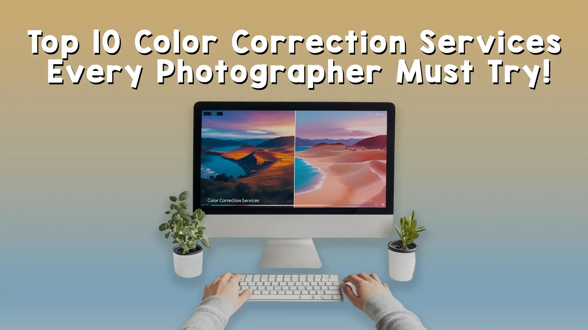
Photography is an art form that captures moments, emotions, and stories in a single frame. However, even the best cameras don’t always get the colors just right. That’s where photo editing color correction comes in—a powerful skill that can transform a dull or off-balanced image into a vibrant, eye-catching masterpiece. Whether you’re a beginner with a smartphone or a professional photographer with high-end gear, mastering photo editing color correction is essential to make your images stand out. In this guide, we’ll walk you through the process step by step, breaking it down into simple, manageable parts so you can confidently enhance your photos. By the end, you’ll understand how to use photo editing color correction to bring your vision to life.
Why Photo Editing Color Correction Matters
Before jumping into the how-to, let’s talk about why photo editing color correction is so important. Colors set the mood of an image. A sunset with muted oranges and pinks might feel lifeless, while a portrait with unnatural skin tones could look awkward. Cameras don’t always capture what our eyes see—lighting conditions, camera settings, or even the weather can throw off the colors. Photo editing color correction fixes these issues, ensuring the hues in your image match the scene you intended to capture. It’s not just about fixing mistakes, though; it’s also about creativity. With photo editing color correction, you can tweak tones to evoke specific feelings, like making a forest greener for a fresh vibe or cooling down a beach shot for a serene look.
Think of photo editing color correction as the magic wand of photography. It bridges the gap between what your camera records and what you want your audience to feel. Whether you’re editing for personal projects or professional clients, getting the colors right is a game-changer. At Image Work India, we see this everyday—clients bring us photos that need a little love, and with expert photo editing color correction, we turn them into stunning visuals.

Understanding the Basics of Color in Photos
To master photo editing color correction, you need to know what you’re working with. Every photo is made up of colors defined by three key elements: hue, saturation, and brightness. Hue is the actual color—like red, blue, or yellow. Saturation controls how intense that color is; high saturation makes colors pop, while low saturation makes them muted. Brightness, or luminance, determines how light or dark the color appears. When you’re doing photo editing color correction, you’ll adjust these elements to fix problems or enhance the image.
Sometimes, a photo might have a “color cast,” where an unwanted tint—like a yellowish glow from indoor lights—affects the whole image. Other times, the colors might just feel flat or unbalanced. The goal of photo editing color correction is to identify these issues and adjust them so the image looks natural or stylized, depending on your vision. Most editing software, like Adobe Photoshop, Lightroom, or even free tools like GIMP, gives you sliders or curves to tweak these elements. Don’t worry if that sounds technical—it’s easier than it seems once you get started.
Choosing the Right Tools for Photo Editing Color Correction
The first step in mastering photo editing color correction is picking the right software. You don’t need to spend a fortune—there are options for every skill level. Adobe Photoshop is a favorite for pros because it offers precise control over every pixel, including advanced photo editing color correction tools like curves and selective color adjustments. Lightroom is simpler, with a streamlined interface perfect for batch editing and quick color fixes. If you’re just starting out, free apps like Snapseed or Canva offer basic photo editing color correction features that are easy to use on your phone or computer.
No matter which tool you choose, the key is to explore its color adjustment options. Look for features like white balance, temperature, tint, and saturation sliders. These are your building blocks for photo editing color correction. Some programs even have auto-correct buttons, which can be a great starting point before you dive into manual tweaks. At Image Work India, our team uses a mix of these tools to deliver top-notch results for clients, proving that the right software makes all the difference.

Step 1: Start with White Balance
Now that you’ve got your tools, let’s begin the photo editing color correction process. The first thing to tackle is white balance. This setting adjusts the overall temperature of your image, removing unwanted color casts. For example, if a photo taken under fluorescent lights looks too green, tweaking the white balance can neutralize it. Most software has a white balance tool—often a dropper or slider labeled “temperature” and “tint.” Temperature moves between warm (yellow/orange) and cool (blue) tones, while tint shifts between green and magenta.
To use it, find something in your photo that should be white or neutral gray, like a wall or a shirt. Click it with the dropper tool, and the software will adjust the colors to make that area neutral, fixing the rest of the image in the process. If there’s no neutral spot, slide the temperature and tint manually until the colors look right to your eye. This step in photo editing color correction lays the foundation for everything else, so take your time to get it spot-on.

Step 2: Adjust Exposure and Contrast
With white balance sorted, the next part of photo editing color correction is tweaking exposure and contrast. Exposure controls how light or dark the image is overall, while contrast defines the difference between the light and dark areas. These aren’t strictly color adjustments, but they affect how colors appear. A too-dark photo can make colors look muddy, while an overexposed one washes them out. Adjusting these settings helps your colors pop naturally.
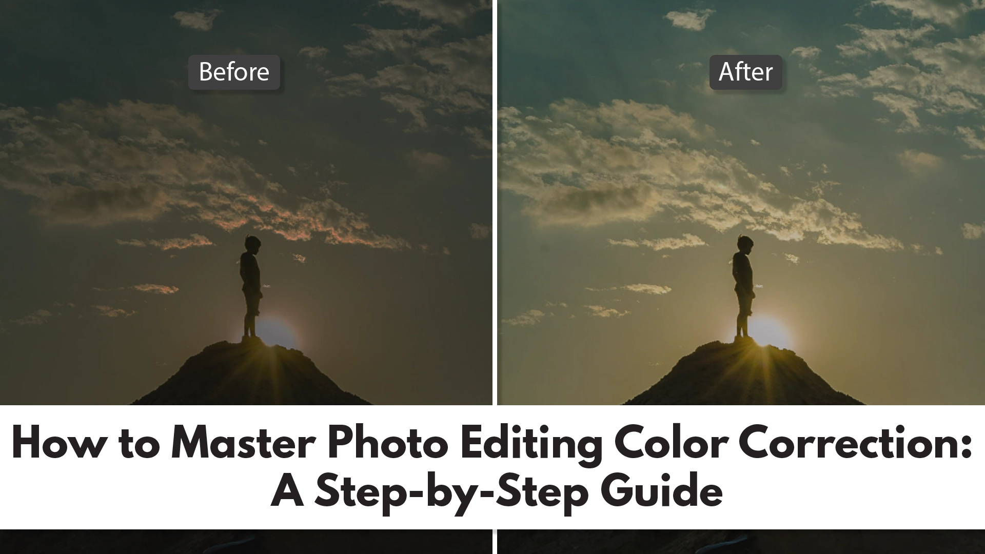
In your editing software, find the exposure and contrast sliders. Move exposure up if the image is too dim, or down if it’s too bright. Then, increase contrast to make the colors stand out more, but don’t overdo it—too much contrast can make the image look harsh. This step in photo editing color correction is about balance; you’re setting the stage for the finer color tweaks to come. Check out some before-and-after examples on the Image Work India blog [link to your blog] to see how these adjustments transform a photo.
Step 3: Fine-Tune Colors with Saturation and Vibrance
Here’s where photo editing color correction gets fun—playing with saturation and vibrance. Saturation boosts the intensity of all colors in the image. Slide it up, and reds get redder, blues get bluer. But go too far, and the photo can look cartoonish. Vibrance is a smarter tool—it increases the intensity of muted colors without overdoing the already bold ones, keeping skin tones natural in portraits, for instance.
Start by nudging the vibrance slider to bring life to dull areas, then tweak saturation if you want a bigger boost. The trick is to enhance the image without making it unrealistic—unless that’s your goal! This part of photo editing color correction lets your creativity shine. Experiment with different levels to see what fits the mood you’re aiming for, whether it’s a subtle tweak or a bold statement.

Step 4: Use Curves for Precision
For more control in photo editing color correction, try the curves tool. It looks like a graph with a diagonal line you can bend into an S-shape or other curves. Each point on the line represents a tone—shadows at the bottom, highlights at the top, midtones in the middle. By adjusting the curve, you can brighten or darken specific tones and even target individual color channels like red, green, or blue.
Click the line to add points and drag them up to lighten or down to darken. Switch to the red channel to reduce a red cast, or boost blue in the blue channel for a cooler vibe. Curves take practice, but they’re a powerhouse for photo editing color correction, letting you fix tricky issues like uneven lighting or stubborn tints. It’s a pro-level move that’s worth learning.

Step 5: Target Specific Colors with Selective Adjustments
Once you’ve got the basics of photo editing color correction down—white balance, exposure, and overall saturation—it’s time to zoom in on specific colors. Sometimes, an image looks mostly great, but one color is off. Maybe the sky is too cyan instead of a deep blue, or the grass looks more yellow than green. This is where selective color adjustments come in, a fantastic feature in many photo editing tools that lets you tweak individual hues without affecting the whole image.
In software like Photoshop or Lightroom, look for a tool called “HSL” (Hue, Saturation, Luminance) or “Selective Color.” These let you pick a color—like red, blue, or green—and adjust its hue (shifting it to a different shade), saturation (making it more or less intense), and brightness (lightening or darkening it). For example, if a person’s skin looks too orange, you can tone down the red and yellow channels. This step in photo editing color correction gives you precision, ensuring every element of your photo looks just right. It’s like having a painter’s palette for your digital canvas—play around until the colors match your vision.
Step 6: Fix Color Casts with Split Toning
Sometimes, despite your best efforts, a photo still has a sneaky color cast that affects the mood. This is especially common in tricky lighting, like golden hour shots with too much warmth or indoor photos with a blue tint from LED lights. Split toning is a photo editing color correction technique that tackles this by adding different colors to the highlights and shadows. It’s a subtle yet powerful way to balance or stylize your image.
In your editing software, find the split toning or color grading panel. You’ll see options to adjust the hue and saturation of the highlights (bright areas) and shadows (dark areas). For a warm photo, try cooling the shadows with a touch of blue while keeping the highlights golden. Or, for a cinematic look, add teal to the shadows and orange to the highlights. This method of photo editing color correction doesn’t just fix problems—it can elevate your photo into something artistic. Take it slow, as small changes can make a big difference.

Step 7: Check Your Work with Before-and-After Views
One of the easiest mistakes in photo editing color correction is over-editing. You might get so caught up in tweaking sliders that you lose sight of the original image. That’s why it’s crucial to compare your edited version with the unedited one. Most editing programs have a before-and-after view—sometimes a toggle button or a split-screen option. Use it often as you work through your photo editing color correction steps.
Look at the colors side by side. Do they feel natural, or have you pushed them too far? Are the skin tones realistic? Does the mood match what you intended? This step isn’t about undoing your work—it’s about refining it. If something looks off, go back to the sliders or curves and adjust. At Image Work India, we always double-check our photo editing color correction results this way, ensuring every image meets our clients’ expectations. It’s a simple habit that saves time and boosts quality.
Common Mistakes to Avoid in Photo Editing Color Correction
Even with the best intentions, it’s easy to stumble when learning photo editing color correction. One common trap is over-saturating colors. Vibrant hues are tempting, but too much saturation can make a photo look fake or garish. Another mistake is ignoring the lighting context—correcting a sunset to look like midday lighting might technically balance the colors, but it kills the natural beauty. Stick to the scene’s intended mood unless you’re deliberately stylizing.
Another pitfall is neglecting small details, like color casts in shadows or highlights. These can sneak by if you’re only focused on the big picture. And don’t rely too heavily on auto-correct features—they’re a starting point, not a finish line. Photo editing color correction is about control, and manual adjustments give you the power to perfect every inch of your image. Learn from these missteps, and you’ll see your skills grow fast.

Practice Makes Perfect: Building Your Skills
Mastering photo editing color correction doesn’t happen overnight—it’s a skill that improves with practice. Start with simple images, like landscapes with clear skies or portraits with even lighting. These give you a straightforward canvas to experiment with white balance, saturation, and curves. As you get comfortable, challenge yourself with trickier shots—mixed lighting, faded old photos, or images with heavy color casts.
Try editing the same photo in different ways. Correct it for a natural look, then push it toward a dramatic style with bold colors. This hands-on approach to photo editing color correction builds your intuition, helping you understand how each adjustment affects the final result. You can even find free stock photos online to practice without risking your own shots. The more you play with photo editing color correction, the more confident you’ll become.
Advanced Tips for Photo Editing Color Correction
Ready to take your photo editing color correction to the next level? Dive into color theory. Understanding complementary colors (like blue and orange) or analogous colors (like green and yellow) can guide your edits. For example, boosting complementary colors in an image creates contrast, while harmonious tones create a cohesive feel. This knowledge turns photo editing color correction into an art form, not just a fix.
Another pro tip is using masks to apply color corrections to specific areas. In Photoshop, you can paint a mask over, say, just the sky, then adjust its blue tones without touching the rest of the image. This precision is a game-changer for complex photos. Also, consider calibrating your monitor—uncalibrated screens can trick you into seeing inaccurate colors, undermining your photo editing color correction efforts. These advanced tricks take time to master, but they’re worth it for standout results.
Bringing It All Together: Your Color Correction Workflow
By now, you’ve got a solid grasp of photo editing color correction—from fixing white balance to fine-tuning specific hues. The key to success is creating a workflow that works for you. Start with the big fixes: white balance and exposure. Then move to overall color enhancements like vibrance and contrast. Finish with detailed tweaks—curves, selective colors, and split toning. Check your progress with before-and-after views, and don’t be afraid to backtrack if needed.
This workflow keeps your photo editing color correction organized and efficient. It’s flexible, too—some images might need more time on curves, others on selective adjustments. With practice, you’ll breeze through the process, turning flawed photos into polished gems. Whether you’re editing for fun or profit, this approach ensures consistent, beautiful results.

Let Image Work India Take Your Photos to the Next Level
Mastering photo editing color correction is a rewarding journey, but it’s not always easy to find the time or expertise to perfect every image. That’s where Image Work India comes in. We’re a professional image editing service dedicated to making your photos shine. From basic color fixes to advanced corrections, our team uses the latest tools and techniques to deliver stunning results tailored to your needs.
Visit us at Image Work India to explore our services. Whether you’re a photographer, a business owner, or just someone with a pile of photos needing love, we’ve got you covered. Check out our portfolio [link to portfolio] or contact us [link to contact page] to see how we can transform your images with expert photo editing color correction. Let us handle the heavy lifting so you can focus on capturing life’s moments!