Photography is an art form that captures moments, emotions, and stories in a single frame. However, the magic doesn’t stop at the click of the shutter. Photo editing color grading is where the real transformation happens, turning a good image into a stunning masterpiece. Whether you’re a beginner or a seasoned photographer, mastering photo editing color grading can elevate your work to a professional level. It’s all about tweaking colors, adjusting tones, and creating a mood that resonates with your audience. In this article, we’ll dive deep into 10 practical and creative photo editing color grading tricks that will help you achieve polished, professional-looking images. Let’s explore how you can enhance your photos with techniques that are easy to understand and apply, all while keeping the process fun and approachable.
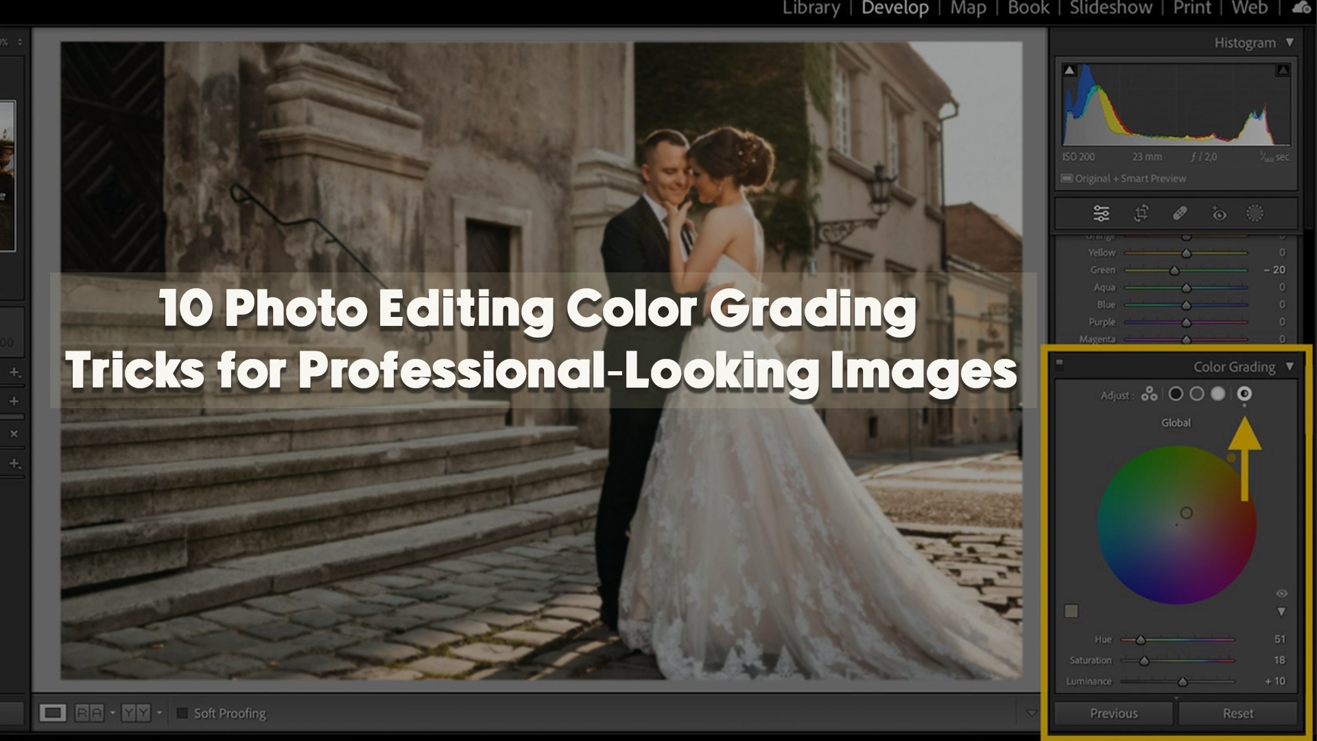
Understanding the Power of Photo Editing Color Grading
Before we jump into the tricks, let’s talk about why photo editing color grading is so important. At its core, color grading is the process of altering and enhancing the colors in an image to achieve a specific look or feel. It’s not just about fixing imperfections; it’s about storytelling. A warm, golden tone might evoke nostalgia, while a cool, blue hue could suggest calmness or melancholy. By mastering photo editing color grading, you gain control over the emotional impact of your images. This technique is widely used in films, advertising, and photography to create a cohesive aesthetic. For instance, think of how blockbuster movies use distinct color palettes to set the tone—photo editing color grading does the same for your still images. With the right tools and knowledge, you can make your photos stand out, whether you’re editing a portrait, landscape, or product shot.

Start with a Solid Base: Correcting Exposure and White Balance
The foundation of great photo editing color grading lies in preparing your image properly. Before you start playing with colors, ensure your exposure and white balance are on point. Exposure determines how light or dark your image appears, and an uneven exposure can throw off your entire color grading process. Use your editing software—whether it’s Adobe Lightroom, Photoshop, or a free tool like GIMP—to adjust the brightness and contrast. Once that’s set, tweak the white balance to ensure the colors in your image look natural. For example, if your photo was taken under fluorescent lights, it might have an unwanted green tint. Correcting this ensures your photo editing color grading efforts build on a clean, accurate canvas. This step might seem basic, but it’s crucial for professional results.

Use Curves to Fine-Tune Your Colors
One of the most powerful tools in photo editing color grading is the curves adjustment. This feature, available in most editing software, allows you to manipulate the tonal range and color balance of your image with precision. Imagine a graph with a diagonal line—you can click and drag points on this line to adjust shadows, midtones, and highlights separately. For instance, pulling the curve upward in the red channel adds warmth, while dipping it in the blue channel cools things down. This trick is perfect for creating subtle shifts or dramatic effects in your photo editing color grading. Play around with the RGB channels individually to see how they affect your image. It’s like having a painter’s palette at your fingertips, letting you blend colors in ways that feel both artistic and intentional.

Experiment with Split Toning for a Unique Look
If you want to add a creative twist to your photo editing color grading, split toning is a fantastic technique to try. This method involves applying different colors to the highlights and shadows of your image. For example, you could add a warm orange to the highlights and a cool teal to the shadows for a cinematic vibe. Split toning is especially popular in portrait and landscape photography because it creates depth and contrast without overwhelming the viewer. In tools like Lightroom, you’ll find a split toning panel where you can adjust the hue, saturation, and balance between the two tones. The key to mastering this photo editing color grading trick is subtlety—start with low saturation and tweak until the effect feels natural yet striking. It’s a simple way to give your images a signature style.
Leverage Color LUTs for Quick, Professional Results
Sometimes, you want professional-grade photo editing color grading without spending hours tweaking settings. That’s where Look-Up Tables (LUTs) come in. LUTs are pre-made color grading presets that you can apply to your images with a single click. Think of them as filters on steroids—they’re designed by experts to achieve specific looks, like a vintage film effect or a modern matte finish. You can find free or paid LUTs online, or even create your own if you’re feeling adventurous. In software like Photoshop or Premiere Pro, applying a LUT is as easy as importing it and adjusting the intensity to suit your image. This photo editing color grading trick is a time-saver for beginners and pros alike, delivering consistent, polished results fast.

Enhance Mood with Selective Color Adjustments
Not every part of your image needs the same color treatment. That’s where selective color adjustments come into play in photo editing color grading. This technique lets you target specific colors—like reds, blues, or greens—and tweak their hue, saturation, or lightness without affecting the rest of the image. For example, if you’re editing a sunset photo, you might boost the oranges and yellows to make the sky pop while keeping the foreground neutral. In Photoshop, the Selective Color tool is your go-to, while Lightroom offers similar control with the HSL (Hue, Saturation, Luminance) panel. This trick adds precision to your photo editing color grading, letting you craft a mood that draws the viewer’s eye exactly where you want it.
Create Depth with Gradient Maps
Gradient maps might sound technical, but they’re a surprisingly simple way to elevate your photo editing color grading. This tool maps a gradient of colors across the tonal range of your image—dark areas get one color, light areas get another, and everything in between blends smoothly. For instance, a gradient map with deep blue shadows and golden highlights can give your photo a dreamy, surreal quality. In Photoshop, you can access gradient maps through the adjustment layers, and the possibilities are endless. The trick here is to experiment with different gradients and adjust the opacity to keep the effect subtle. It’s a creative approach to photo editing color grading that adds depth and sophistication to your work.

Balance Saturation and Vibrance for Natural Results
When it comes to photo editing color grading, it’s tempting to crank up the saturation to make colors pop. But overdoing it can leave your images looking unnatural or cartoonish. Instead, use a combination of saturation and vibrance to strike the right balance. Saturation affects all colors equally, while vibrance boosts only the less saturated areas, preserving skin tones and subtle hues. For example, in a portrait, increasing vibrance can enhance the background without making the subject’s face look overly pink. Most editing tools have sliders for both, so play with them to find a sweet spot. This photo editing color grading trick ensures your images look vibrant yet believable—key for that professional polish.
Master Color Harmony with Complementary Tones
One of the secrets to standout photo editing color grading is understanding color harmony. Complementary tones—colors that sit opposite each other on the color wheel, like blue and orange or red and green—can create a visually pleasing balance in your images. When you’re editing, think about how you can emphasize these pairings. For instance, in a landscape photo with a blue sky, you might enhance the warm browns or oranges in the foreground to make the scene pop. In tools like Lightroom or Photoshop, you can use the HSL panel or selective color adjustments to boost these complementary hues. The trick is to keep it subtle—overdoing it can make the image feel forced. By focusing on color harmony in your photo editing color grading, you’ll craft images that feel cohesive and professional, drawing viewers in naturally.
Soften Harshness with Desaturation Techniques
Sometimes, less is more in photo editing color grading. Desaturation—reducing the intensity of colors—can give your images a sophisticated, understated look that’s perfect for moody portraits or minimalist shots. Instead of desaturating the entire image, try targeting specific areas or colors. For example, if a bright red shirt distracts from a subject’s face, lower the red saturation selectively. In Photoshop, you can use a Hue/Saturation adjustment layer with a mask to control where the effect applies. Alternatively, in Lightroom, the HSL panel lets you dial back individual colors. This photo editing color grading trick is all about restraint—it softens harshness and creates a refined aesthetic that feels timeless, making your work look effortlessly polished.

Play with Shadows and Highlights for Dramatic Effect
Shadows and highlights aren’t just about exposure—they’re powerful tools in photo editing color grading too. By adding a tint to your shadows or highlights, you can create a dramatic, eye-catching effect. For instance, tinting shadows with a deep purple while keeping highlights warm can give your photo a bold, artistic edge. In Photoshop, the Camera Raw filter offers a Shadows/Highlights tool where you can tweak these areas separately. Lightroom’s Tone Curve also lets you add color to specific tonal ranges. The key to this photo editing color grading technique is experimentation—try different combinations to see what suits your image best. It’s a fantastic way to add personality and depth, turning a flat photo into something dynamic and professional.

Use Color Grading Presets as a Starting Point
If you’re new to photo editing color grading or just want to speed up your workflow, presets are your best friend. These are pre-configured settings that apply a specific color grading style to your image instantly. Many editing programs, like Lightroom, come with built-in presets, and you can also download custom ones from sites like Image Work India (check out our preset collection for inspiration). Start with a preset that matches your vision—say, a vintage fade or a bold contrast look—then tweak it to fit your photo. Adjust the exposure, saturation, or split tones to make it your own. This photo editing color grading trick saves time while teaching you how pros combine settings, helping you build your skills as you go.
Final Touches: Contrast and Vignetting
No photo editing color grading session is complete without some finishing touches. Boosting contrast can make your colors pop even more, adding definition to your image. Use the contrast slider or curves tool to deepen shadows and brighten highlights. Then, consider adding a vignette—a subtle darkening around the edges—to draw attention to the center of your photo. This classic trick enhances focus and gives your image a polished, professional edge. In Lightroom, the vignette tool is under the Effects panel, and you can adjust the amount, midpoint, and feathering to suit your style. These small tweaks in your photo editing color grading workflow can make a big difference.

Why Photo Editing Color Grading Matters for Every Photographer
By now, you’ve seen how photo editing color grading can transform your images from ordinary to extraordinary. It’s not just about making photos look pretty—it’s about expressing your unique vision. Whether you’re aiming for a soft, romantic vibe or a gritty, high-contrast style, these techniques give you the tools to get there. Each trick we’ve explored, from curves to presets, builds on the last, creating a workflow that’s both flexible and powerful. The beauty of photo editing color grading lies in its versatility—you can adapt it to any genre, from wedding photography to product shots, and make every image feel like it belongs in a gallery.

Elevate Your Skills with Practice and Tools
The more you experiment with photo editing color grading, the better you’ll get at spotting what an image needs. Start with simple adjustments like exposure and white balance, then layer in advanced techniques like gradient maps or split toning. Invest time in learning your editing software—whether it’s Photoshop, Lightroom, or even mobile apps like Snapseed. Each tool offers unique ways to enhance your photo editing color grading process. And if you’re short on time or need a pro touch, consider outsourcing to experts who live and breathe this craft—like the team at Image Work India.
Practical Tips for Consistent Results
Consistency is key in photo editing color grading, especially if you’re working on a series of images. To keep your edits uniform, start by creating a custom preset or saving your settings after editing one photo. Apply these to the rest of your batch, then fine-tune as needed. Another tip is to step away from your screen for a few minutes after editing—fresh eyes can spot overdone effects or missed opportunities. And don’t be afraid to reference professional work for inspiration. Sites like Image Work India offer tutorials and examples (like this color grading guide) that can spark ideas and refine your approach. With practice, your photo editing color grading skills will become second nature.

Promote Your Photography with Image Work India
Mastering photo editing color grading is a game-changer, but it’s not always easy to do alone. That’s where Image Work India comes in. We’re a top-tier image editing service dedicated to helping photographers and businesses achieve stunning, professional results. From color correction to advanced photo editing color grading, our team at Image Work India has the expertise to bring your vision to life. Whether you need a quick tweak or a full overhaul, we’ve got you covered with affordable, high-quality services. Check out our portfolio to see how we’ve transformed images for clients worldwide. Let us handle the editing so you can focus on capturing the perfect shot—visit Image Work India today and take your photography to the next level!