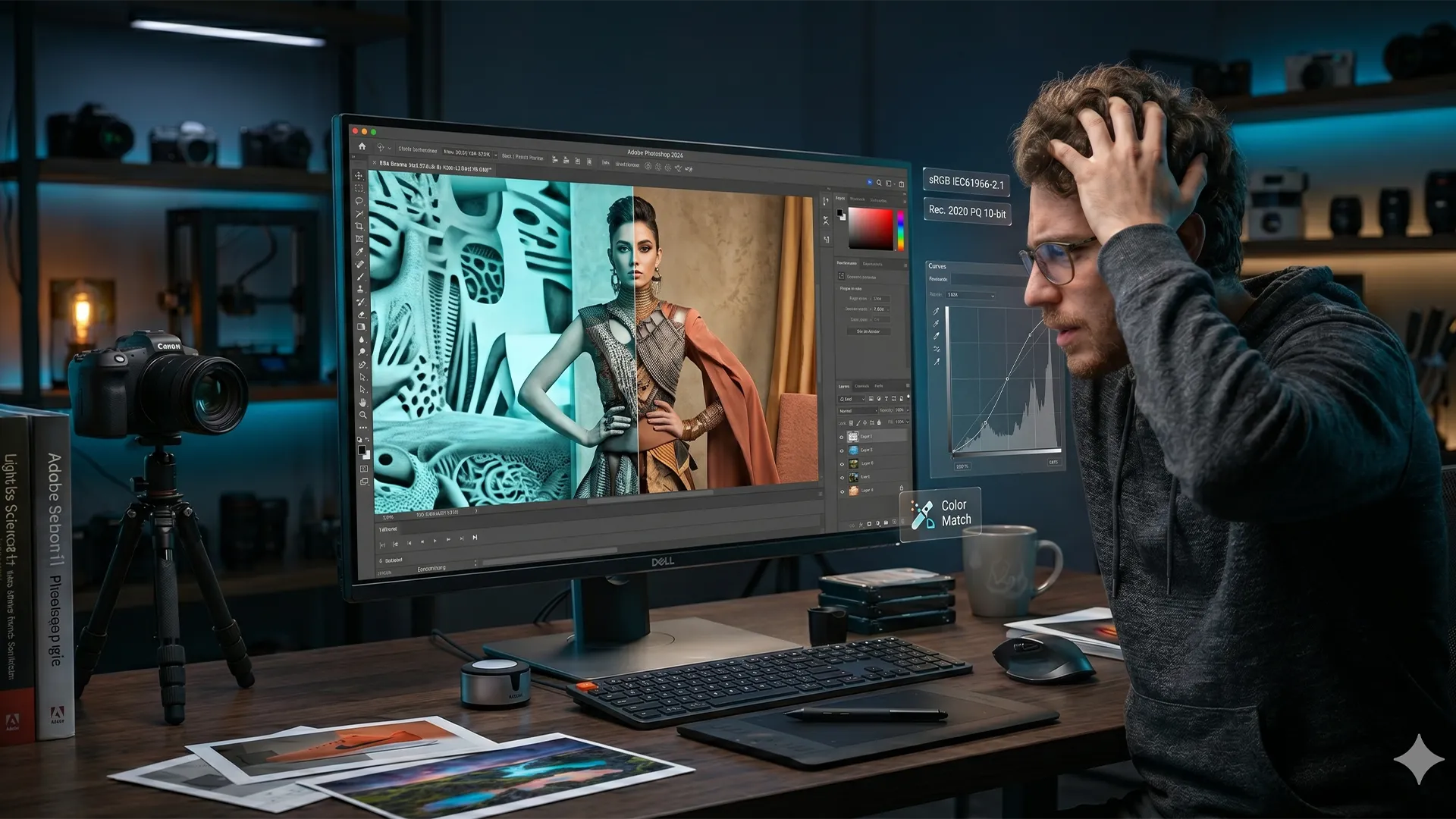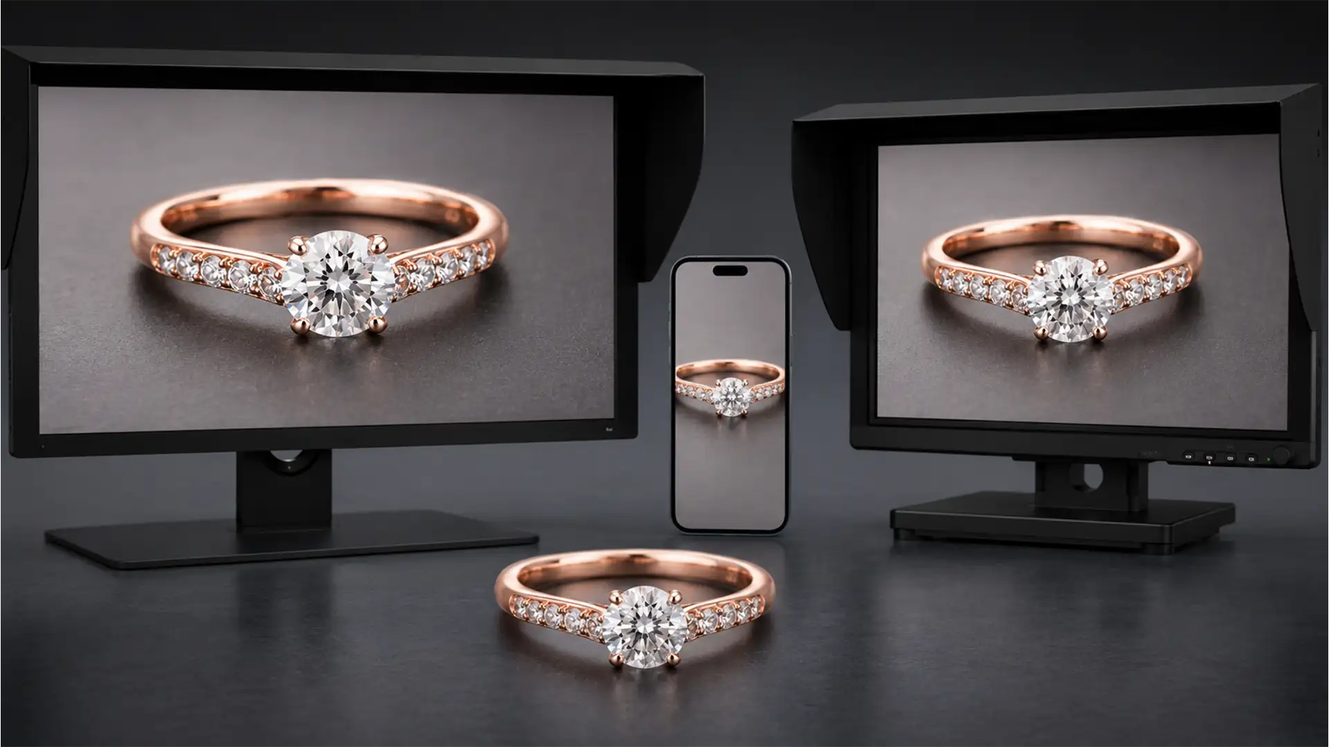
You’ve spent hours meticulously retouching a high-end rose gold ring. On your calibrated desktop monitor, it looks luxurious and perfectly balanced. But the moment you view the exported image on an iPhone, disaster strikes: the elegant rose gold suddenly looks like cheap copper or harsh, oversaturated pink.
If this sounds familiar, you are experiencing the dreaded Display P3 gamut mismatch. Matching rose gold color profiles across displays is notoriously difficult because its spectral reflectance sits precariously between red, magenta, and yellow. When viewed on uncalibrated monitors or wide-gamut mobile displays, standard hex codes shift aggressively.
In this guide, we’ll break down the technical workflow to lock in your color profiles in Photoshop, ensuring your jewelry retouching looks premium and accurate on absolutely every screen.
The Science Behind the Shift: Why Rose Gold Looks Like Copper
The core of the problem lies in how different screens interpret color data. Standard e-commerce workflows rely on the sRGB IEC61966-2.1 color space. However, modern mobile devices (like Apple’s iPhones) use the Display P3 color gamut, which is roughly 25% wider than sRGB, particularly in the red and green spectrums.
When you use standard Rose Gold hex codes like #B76E79 or #E0BFB8, an unmanaged Display P3 screen will stretch those values to the edge of its wider gamut. This oversaturates the red channel, causing the jewelry to look like copper. Furthermore, if you edit in a massive color space like ProPhoto RGB and export without properly converting your ICC profile, the resulting Delta E (color difference) will be massive.
Here is exactly how to fix these shifts in Photoshop v24.x and v25.x.
How to Fix Rose Gold Color Shifts in Photoshop
Method 1: The Quick Fix – Strict sRGB Conversion
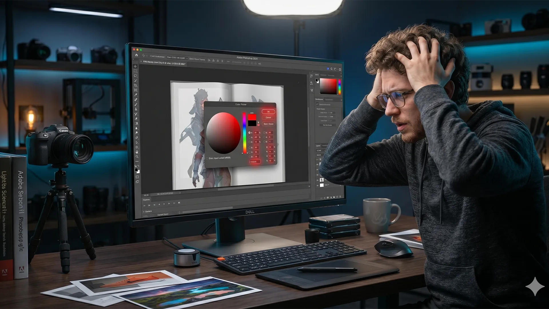
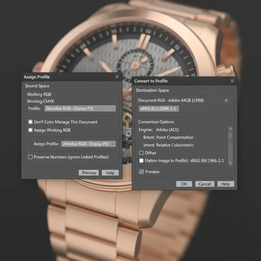
The most common mistake retouching beginners make is using “Assign Profile” instead of “Convert to Profile” when preparing an image for the web.
Assigning a profile simply changes the label on the color data without changing the underlying numbers, leading to drastic color shifts. Converting mathematically shifts the colors to look as identical as possible in the new destination space.
- Finish your retouching in your preferred working space.
- Navigate to Edit > Convert to Profile.
- Under Destination Space, select sRGB IEC61966-2.1.
- Click OK and export.
Method 2: The Pro Workaround – Selective Color Neutralization
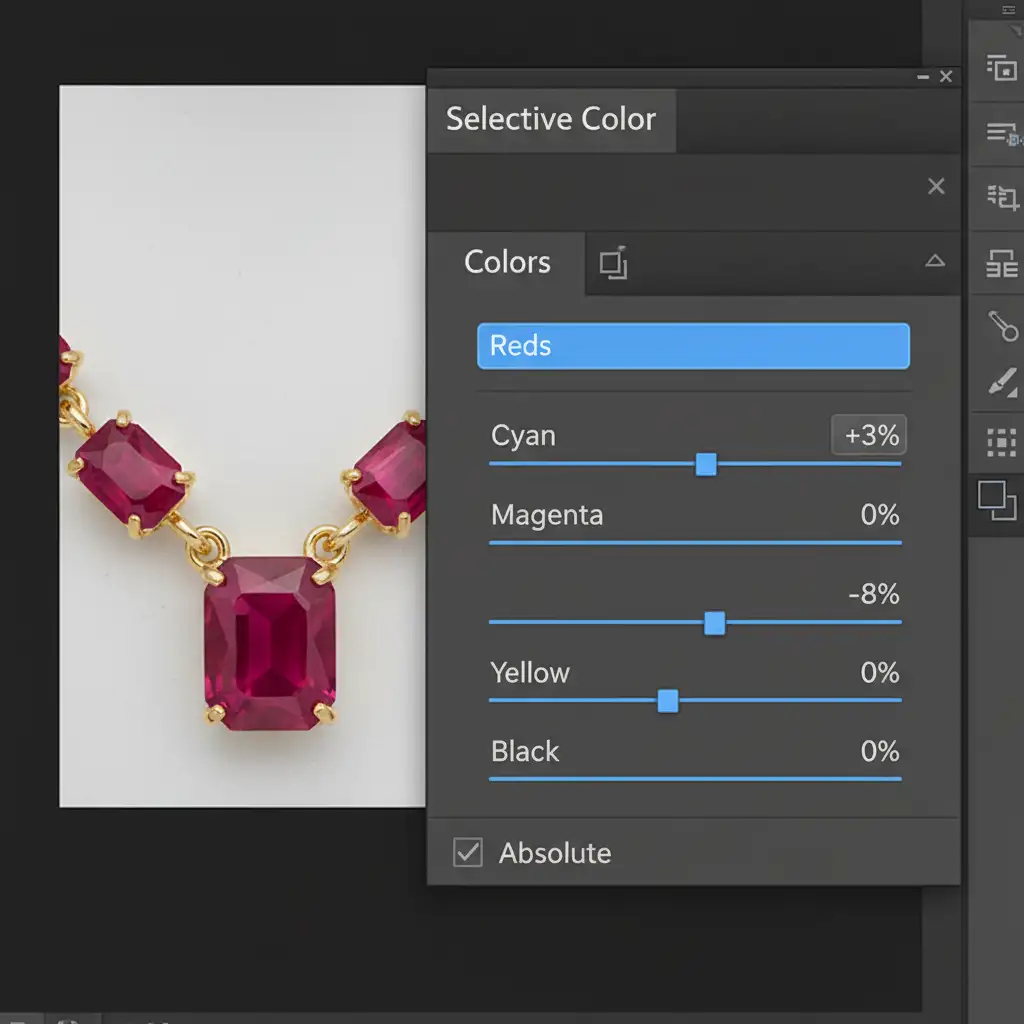
Even with proper conversion, Display P3 screens can still pull too much warmth from rose gold. To proactively combat this, high-end jewelry retouchers use a targeted Selective Color adjustment layer to neutralize the copper tint before export.
- Add a Selective Color adjustment layer above your jewelry group.
- Target the Reds channel.
- Reduce Yellow by 5-10% (this pulls out the cheap copper feel).
- Add 2-3% Cyan (this introduces a complementary cooling effect that protects the delicate rose hue).
- Repeat subtly in the Yellows channel if the gold still feels too brassy.
Method 3: The Technical Deep-Dive – Soft Proofing & Color Policies
If you are handling both web e-commerce and print catalogs, relying solely on your monitor isn’t enough—even with strict hardware calibration. You must utilize Photoshop’s Soft proofing feature to simulate how the image will look on a mobile device or after a CMYK conversion.
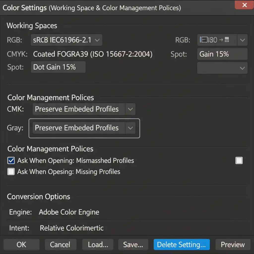
First, ensure your foundational color settings are protecting your files:
- Go to Edit > Color Settings.
- Under Color Management Policies, ensure RGB, CMYK, and Gray are all set to Preserve Embedded Profiles. This stops Photoshop from silently stripping your color data.
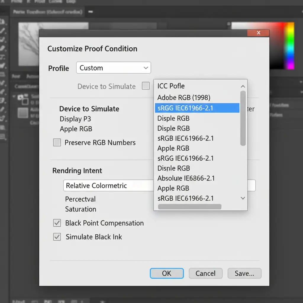
Next, set up your soft proof:
- Go to View > Proof Setup > Custom.
- Under “Device to Simulate”, select sRGB IEC61966-2.1 (for web) or U.S. Web Coated (SWOP) v2 (for print).
- Check the Out-of-gamut warning (View > Gamut Warning) to see if any of your rose gold highlights are clipping.
Stop Losing Sales to Bad Color: Let the Experts Handle Your Jewelry Retouching
Achieving the perfect rose gold tone across all devices is a highly technical challenge. Gamut mismatches, improper profile conversions, and shifting display technologies can easily make your premium jewelry look cheap, directly impacting your conversion rates and brand trust.
You don’t have to fight Photoshop’s color management system alone.
At Image Work India and Cloud Retouch, we specialize in precise, high-end jewelry color correction. Our expert retouchers utilize strictly calibrated environments and advanced color science to guarantee your products look flawlessly premium—whether your customer is viewing them on a desktop monitor, a printed catalog, or the latest Display P3 smartphone.
Ready to elevate your jewelry imagery? Contact Image Work India and Cloud Retouch today, and let us ensure your rose gold always looks like real rose gold.