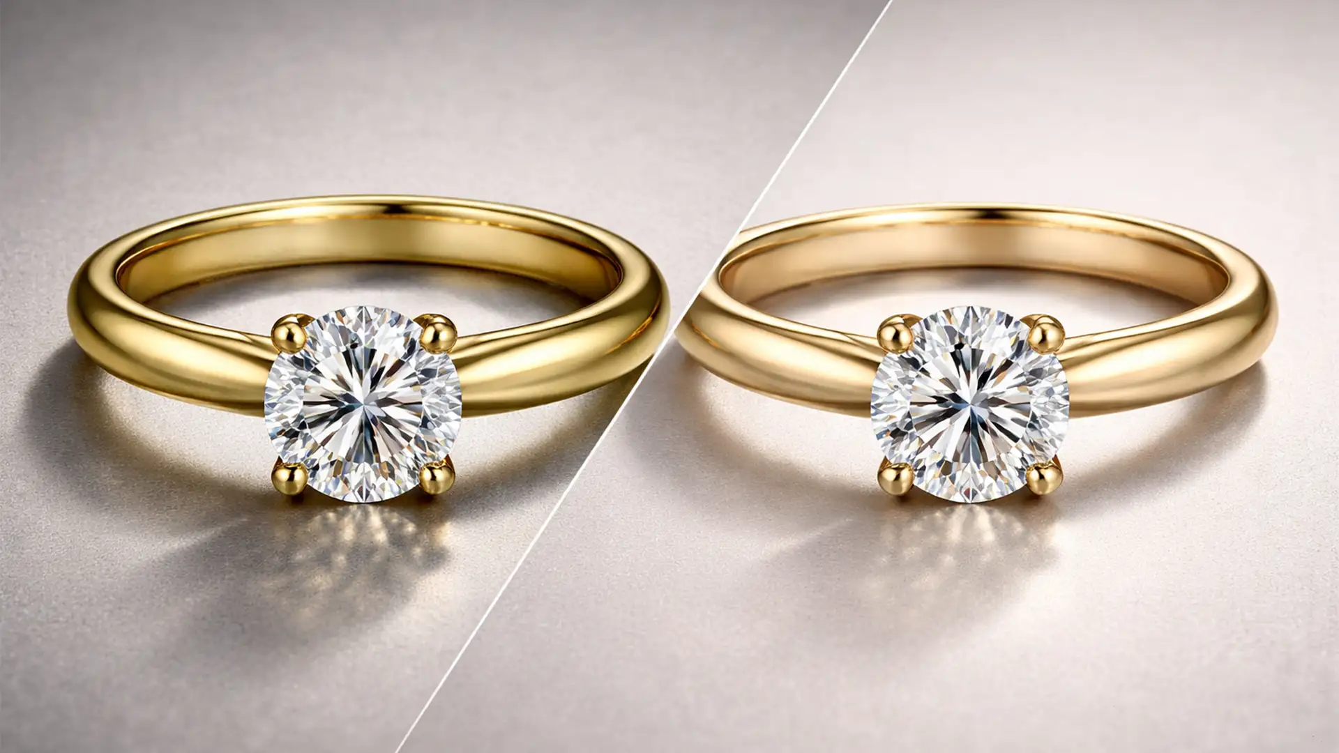
Have you ever spent hours photographing 18k or 24k gold jewelry, only to open the files and find a cheap, brassy, or sickly green tint? You’re not alone. Environmental reflections and tricky white balance often ruin the elegance of high-end pieces, causing them to fail luxury brand standards. If you want to achieve the Cartier creamy gold look in Photoshop, you cannot rely on basic saturation sliders. You need a precise, non-destructive editing workflow that manipulates luminance, neutralizes harsh undertones, and protects your specular highlights. In this guide, we will show you exactly how to transform cheap-looking yellow metal into a premium, creamy gold finish.
Why Your Gold Photography Looks Brassy (And How to Fix It)
In high-end jewelry retouching-specifically using Photoshop v24.x and v25.x-the core technical challenge is mitigating environmental color casts. Gold acts like a mirror. If there is a slight green tint in your studio, or if your strobes fire too warm, 18k gold will absorb it, resulting in brassy tones.
A true creamy gold finish relies on high luminance, lower saturation in the midtones, and precisely balanced magenta-to-yellow ratios in the shadows. Before you begin color grading, it is highly recommended to use Frequency Separation to clean up any dust or scratches on the metal without destroying the gradient textures. Once the metal is clean, you can proceed with the following color correction methods.
Method 1: The Quick Fix Using Camera Raw (HSL Adjustments)
If you need a rapid turnaround for high-volume e-commerce, the Camera Raw Filter is your best starting point. This method uses targeted HSL Adjustments to strip away the ugly green/cyan contamination.
- Convert your jewelry layer to a Smart Object (for non-destructive editing).
- Open the Camera Raw Filter (Ctrl+Shift+A or Cmd+Shift+A).
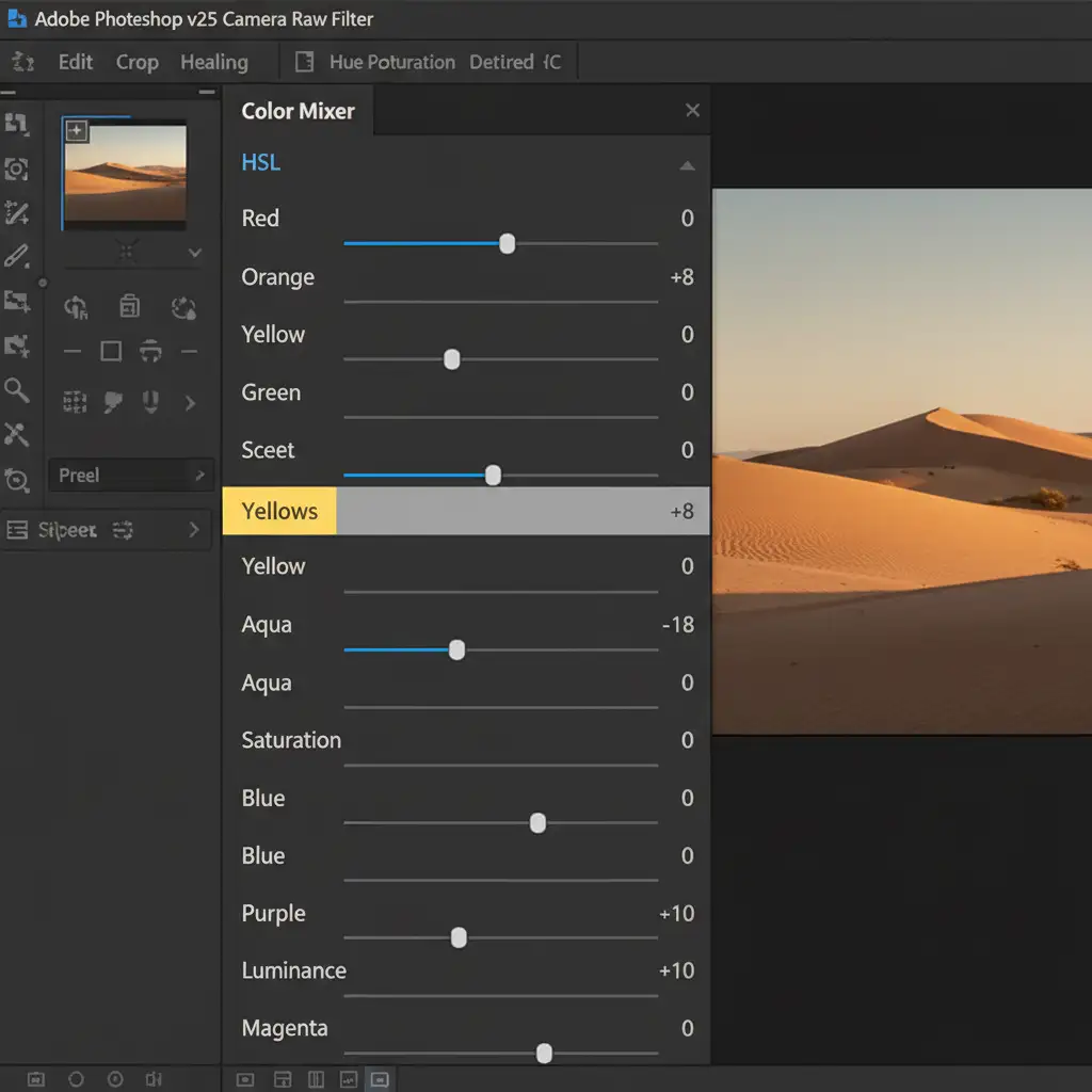
- Navigate to the Color Mixer panel and select the HSL (Hue, Saturation, Luminance) tab.
- Saturation: Reduce the saturation of Yellows by -15 to -20. This instantly removes the cheap brassiness.
- Hue: Slightly shift the Yellow hue towards Orange to warm up the metal.
- Luminance: Push the Luminance of Yellows up by +10. This is the secret to creating that bright, creamy feel.
Method 2: The Pro Workaround with Selective Color
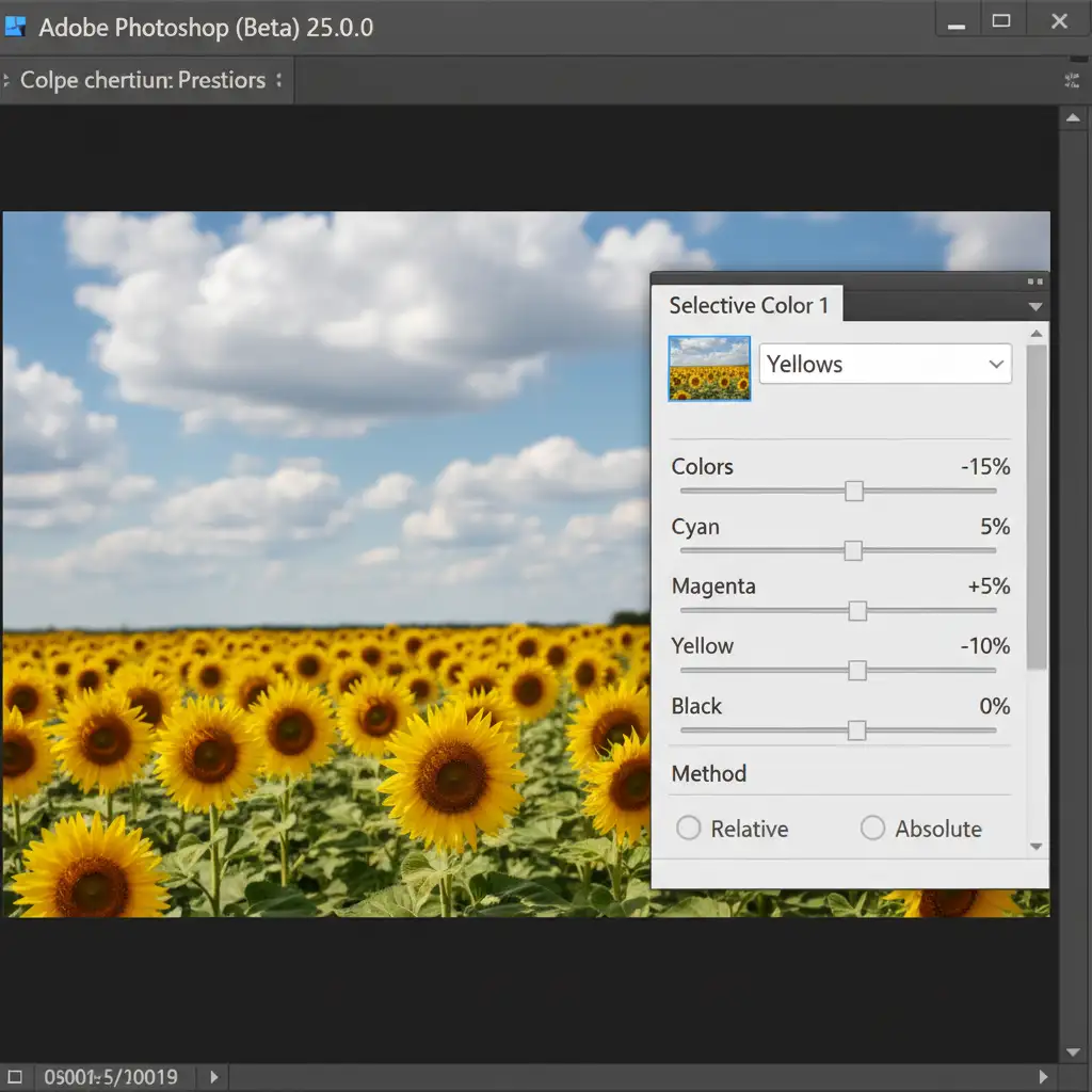
For a more refined luxury aesthetic, professionals rely on Selective Color. This adjustment layer allows you to inject specific CMYK values into the yellow spectrum, offering unparalleled control over the metal’s undertones.
- Create a Selective Color adjustment layer above your base image.
- From the Colors dropdown, target the Yellows channel.
- Reduce Cyan to -15%: This directly eliminates the sickly green tint caused by studio reflections.
- Increase Magenta to +5%: This adds a subtle, luxurious warmth.
- Reduce Yellow to -10%: This softens the harshness of the metal, pushing it toward a creamy pastel.
- Next, target the Neutrals channel and boost Yellow by +2% to unify the midtones.
- Finally, invert the layer mask (Ctrl+I) and use a soft brush to paint this effect only on the gold metal, avoiding gemstones.
Method 3: The Technical Deep-Dive Using Gradient Maps
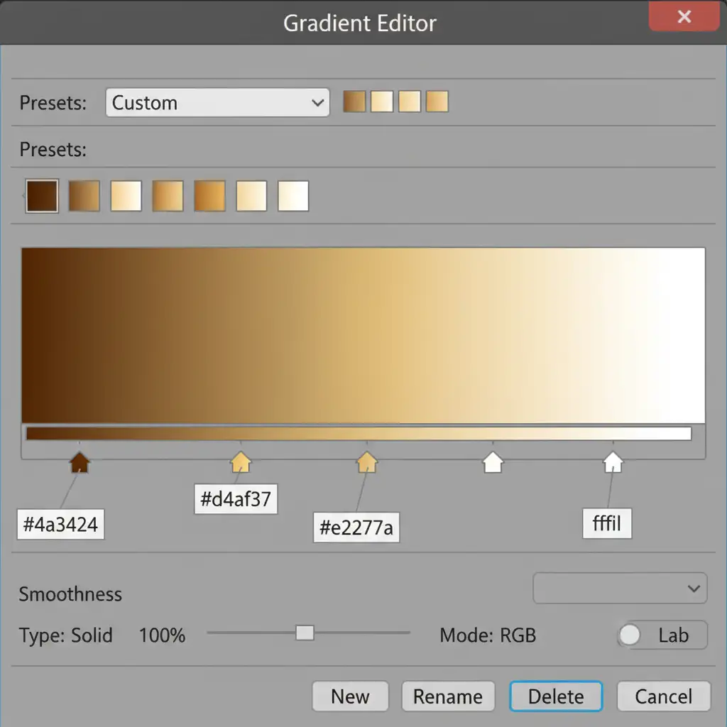
To truly achieve the Cartier creamy gold look in Photoshop, you must dictate the exact colors of the shadows, midtones, and highlights. A Gradient Map allows you to map specific luxury hex codes directly to the luminosity values of your image.
- Add a Gradient Map adjustment layer.
- Right-click the layer and select “Create Clipping Mask” so it only affects the isolated jewelry layer.
- Click the gradient bar to open the Gradient Editor and input these specific Cartier-style hex codes:
- Shadows (Left node): Warm dark brown (#4a3424)
- Midtones (Middle nodes): Soft caramel to creamy gold (#d4af37 to #e2c77a)
- Highlights (Right node): Pure white (#ffffff)
- Change the layer’s blend mode to Color or Soft Light.
- Lower the layer opacity to 40-60% to blend the creamy tones naturally with the original metal texture.
Perfecting the Look with Blend If
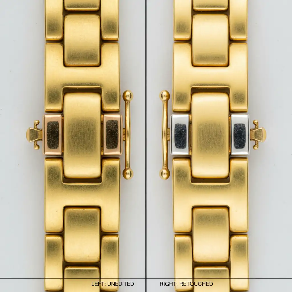
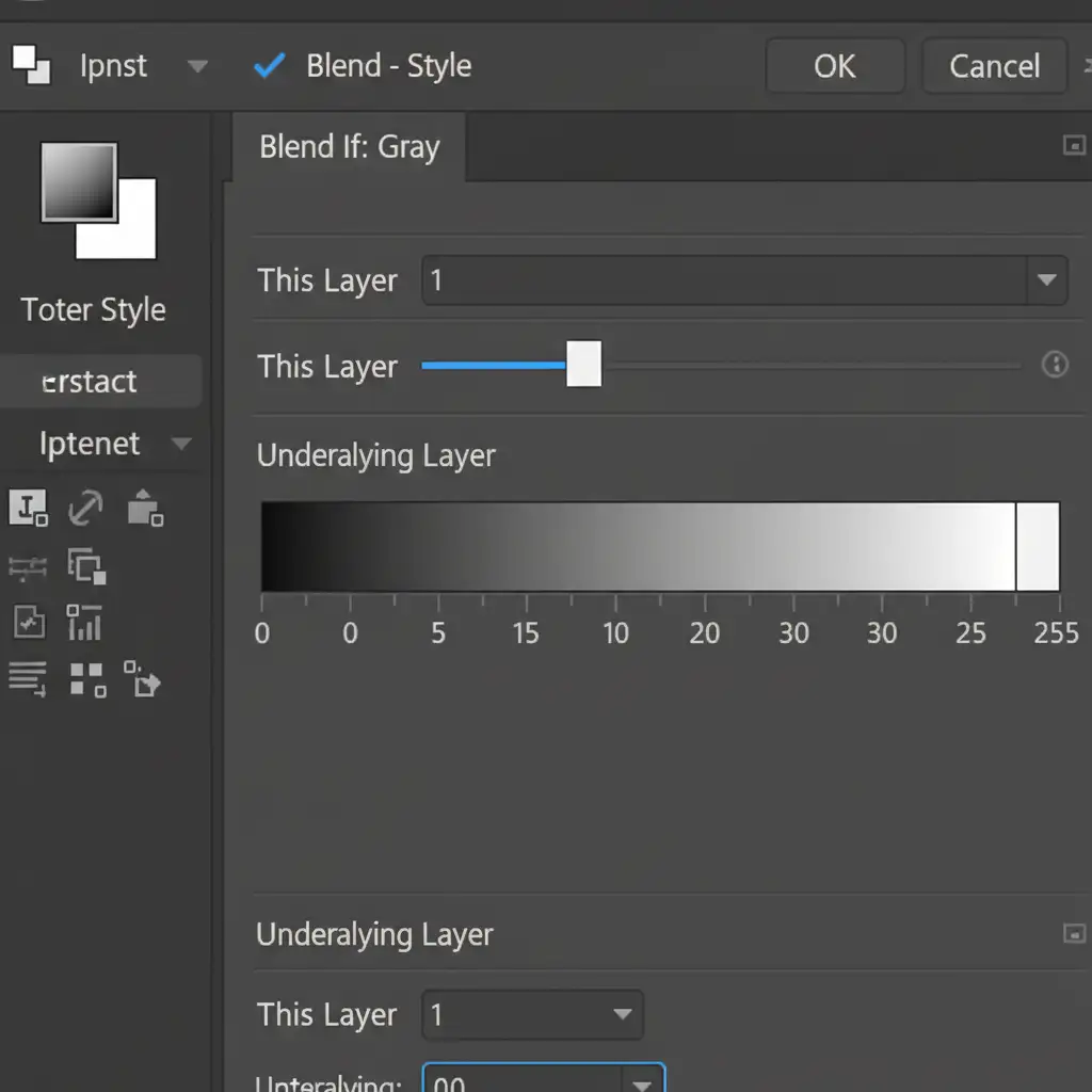
The final step in color grading luxury jewelry is ensuring the adjustment layers do not flatten the image. You must protect your specular highlights (the bright, pure white reflections on the metal) and the deepest shadows.
Double-click your Gradient Map layer to open the Layer Style dialog box. Look at the Blend If (Underlying Layer) sliders at the bottom. Hold Alt (or Option) and click the white slider on the right to split it. Drag the left half of the split slider toward the center (around 200-220). This protects the brightest highlights from taking on a yellow tint, keeping the metal looking highly polished and realistic.
Scale Your High-End Jewelry Retouching with Image Work India
Learning how to achieve the Cartier creamy gold look in Photoshop is a game-changer for your portfolio, but executing this multi-step workflow on hundreds of catalog images is incredibly time-consuming. E-commerce success requires both perfection and volume.
If you are tired of spending hours tweaking Selective Color layers and Blend If sliders to fix brassy tones, let the experts handle it. Image Work India and Cloud Retouch specialize in high-end, luxury jewelry retouching. Our dedicated team of professional retouchers understands the exact color science required to maintain a consistent, premium aesthetic across your entire catalog.
Stop settling for subpar product photos. [Contact Image Work India today] to outsource your jewelry color grading and elevate your brand to luxury standards.